Tableau Calculations
Introduction to Calculations Transcript
Table Calculation: Add a new column that adds the Wait Columns Less than 7, 14 and 30
–In Measures Data Tab, Left Click on Less than 7 Days, Create Calculated Field
–Put in this formula: sum([Appts Under 7])+sum([Appts Under 14])+sum([Appts Under 30])
–Rename This as: All Apts Less 30
Drag Names to Columns
# All Less 30 Days to Rows
# Tot Appt to Rows
Select Side by Side bar graph in Show Me
Part 2: Add % of Total Calculation
Resume with the visualization above
-In Data Pane, left click on # All Apts Less 30 Days
-Create calculated field
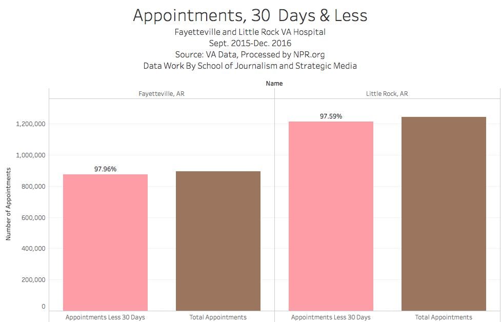
-Use this formula: All Apts Less 30/sum(Tot Appts)
-Rename it % 30 Days and Less
-Drag % 30 Days and Less to Labels on Marks Card
-On Tot Appt Bar, Left Click: Mark Label, Never Show.
You should have a chart that looks something like this:
VA Workforce
Data Dictionary
-
- va_dump_full_time_employee
- ● station_id: VA station identification code
- ● name: VA station name
- ● ref_date: Date when the information was extracted from the original source
- ● visn_id: VA Veterans Integration Service Number
- ● prioritized: Stations that were designated to receive additional funding
- va_dump_full_time_employee
○ 1: prioritized, 0 otherwise
-
- ● occupation_id: Occupation code
- ● occupation_desc: Occupation description
- ● employees: Number of employees
- ● state: Facility state
- ● address: Facility postal address
- ● postal_code: Facility postal code
- ● latitude: Facility latitude coordinate
- ● longitude: Facility longitude coordinate
- ● phone: Facility phone number
- ● fax: Facility fax number
- ● url: Facility website url
Question: Calculate the percentage each individual position (nurses, police, janitors, etc) as a percentage of the entire staff at Fayetteville, Little Rock.
Columns: Name
Rows: Occupation Description
Text (Marks Card): # Employees
–Click Sum # Employees Green Pill on Marks Card. Add Table Calculation.
–Compute Using Table Down
–Percent of Total
Drag # Employees to Text Again
Question: What percentage of the staff is medical versus administrative?
A: Create a bar chart with the occupations by Individual hospital.
- Name to Columns.
- Occupation Desc to Rows
- # Employees to Text Marks Card
- Filter Name to Fayetteville
- Sort descending (Nurses should be on top)
- Click “Show Me” in Upper Right Corner, Select Horizontal BarsB: Create Group
1.After the top 10, highlight Medical Technologist to the End (Voucher Examining)
2. Grey box appears (Keep Only, Exclude, etc). Select Paper Clip icon, which is Group Members
3. Your chart resizes and all of the 96 categories you just selected are now on top as a single group.
4. Rename group as “all other”
5. Left Click on green pill in columns: SUM(Employees) . Select Quick Table Calculation. Percent of Total.
6. Drag # Employees to Text Label on Marks card. You now have a horizontal bar chart with an x-axis to 40% and Other labeled at 544 workers in Fayetteville.
Tip: Create a set of the occupational data
http://onlinehelp.tableau.com/current/pro/desktop/en-us/sortgroup_sets_create.html
Question 3: Group By Medical / Non-Medical Profession.
Using the techniques above, group the Fayetteville staff by medical and non-medical workers.
Display percentage of the whole on the labels
Show a filter on your chart so readers can compare Fayetteville vs. Little Rock
HOMEWORK
Compare the Fayetteville to Little Rock staff by Medical versus non-Medical categories.
Produce a chart or charts that spells out the medical versus non-medical staffing. Remember to use the tools in class: grouping data, assigning percentages and total staffing. Clearly label your data and clean up the legends.
Graphics are due 11:59 p.m. Sunday, Oct. 1 as a blog post on WordPress
Formatting Tips.
–Labels. Resizing.
–To get all labels to display. Click on the unlabeled bar, click off automatic and display label always

