Agenda for Thursday, Feb. 1
Data: Continue Working With Census Data.
–Task #1: Use Tableau to Visualize Census Data from Homework.
–Task #2: Visualize Poverty and Female Households from Census Data
–Task #3: Download Census Data with Demographic Information.
6:30 pm Guest speaker by Skype: Bobby Ampezzan, Arkansas Public Media.
Examine Occupations and Salaries in OES Database
Reading Discussion: Nickel and Dimed. The Holdouts.
-Low-wage worker you intend to interview for the class
Task #1: Use Tableau to Visualize Census Data from Homework.
Here’s a start:
–Download and clean the data: US Ark Counties Poverty ACS_16_5YR_DP03_with_ann-1w6iwss
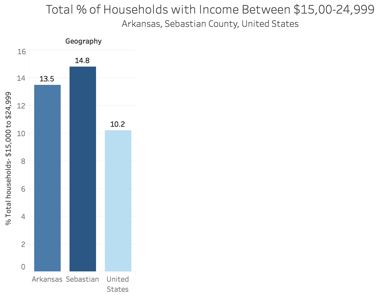
We have a lot of data in this spreadsheet. Let’s simplify things. We will visualize just one column- Column J –:
“Percent; INCOME AND BENEFITS (IN 2016 INFLATION-ADJUSTED DOLLARS) – Total households – $15,000 to $24,999”
–Copy the “Edited Poverty” tab and rename it Min Wage Only
–Delete all of the columns except for the Percent; INCOME AND BENEFITS (IN 2016 INFLATION-ADJUSTED DOLLARS) – Total households – $15,000 to $24,999″
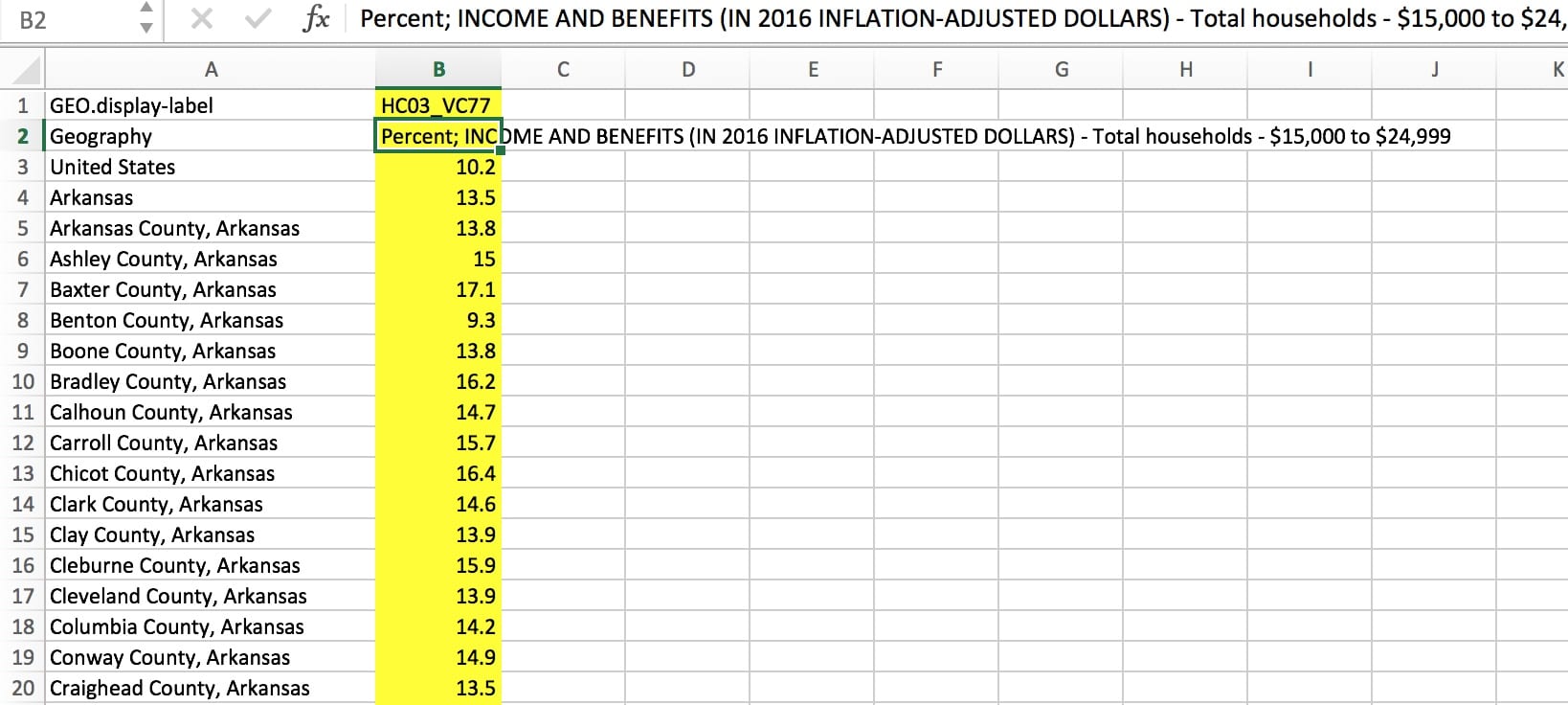
–Fix the column headings so it plays nice with Tableau. Delete the Row 1 “GEO.display-label…”
–Simplify your new column B: % Households – $15k-$25k
–Save, backup etc and open Tableau.
–Import your data
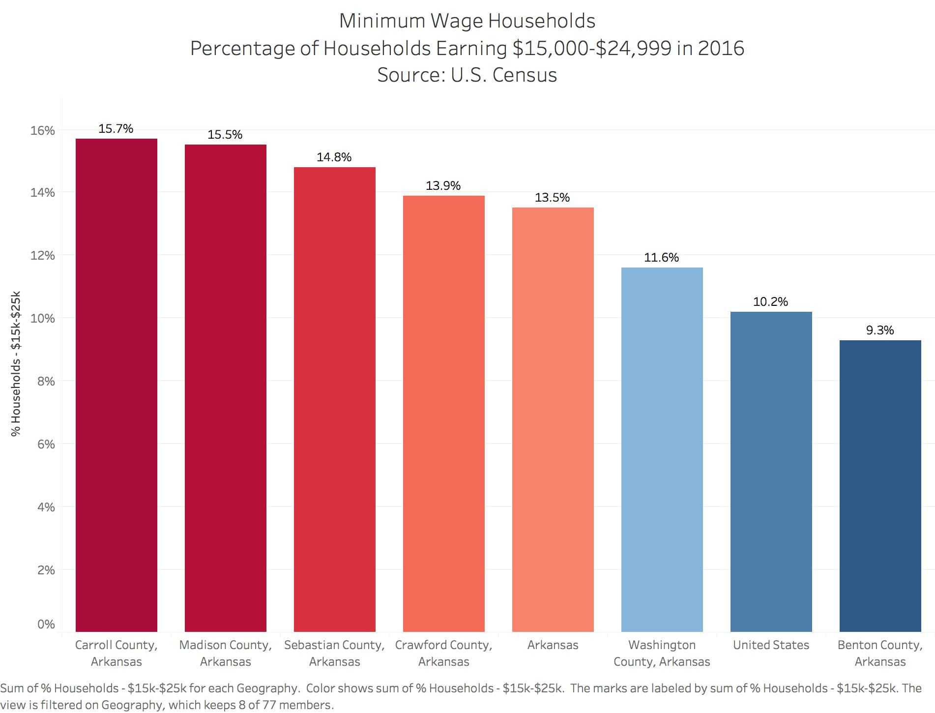
–Open new tab
–Geography to Columns. % Households $15k- $25k to rows
–Sort by largest-smallest
–Filter by Geography – drag Geography to Filter. Filter to keep the following:
Arkansas, Benton,Carroll, Crawford, Madison, Sebastian, United States, Washington
Formatting. This is the standard formatting you will apply to all of your charts in some fashion. We are simplifying and clearly marking the labels
–Drag to Label in Marks box: % Households $15k- $25k to rows
–Format Label to % – Format | Pane | Default | Numbers | Numbers: Custom | 1 decimal. % as suffix.
–Format Y Axis to %. – Format | Axis | Scale | Numbers | Number: Custom | no decimal, % as suffix.
–Color the bars. Drag to colors in Marks box: % Households $15k- $25k to rows. Edit colors to blue – red scale, reverse colors so red = highest.
–Label graph: Double Click on “Sheet 1” above the chart. Text box emerges with <Sheet Name> Type in name of chart: Minimum Wage Households Percentage of Households Earning $15,000-$24,999 in 2016 Source: U.S. Census
–Fix X axis labels (squished) . Drag the right chart out to expand the visualization.
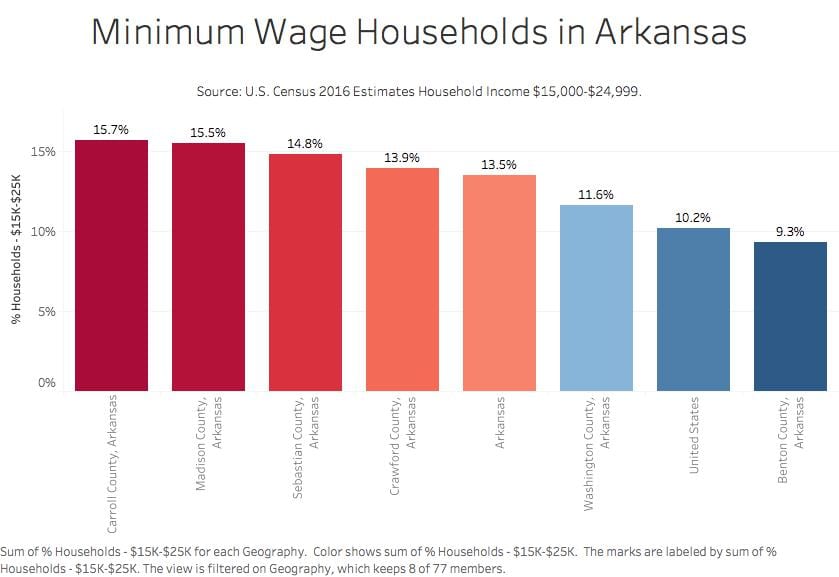
Export image
–Worksheet | Export | Image
–Click off color legend option
–Title Minimum Wage Arkasas. Save as .jpeg
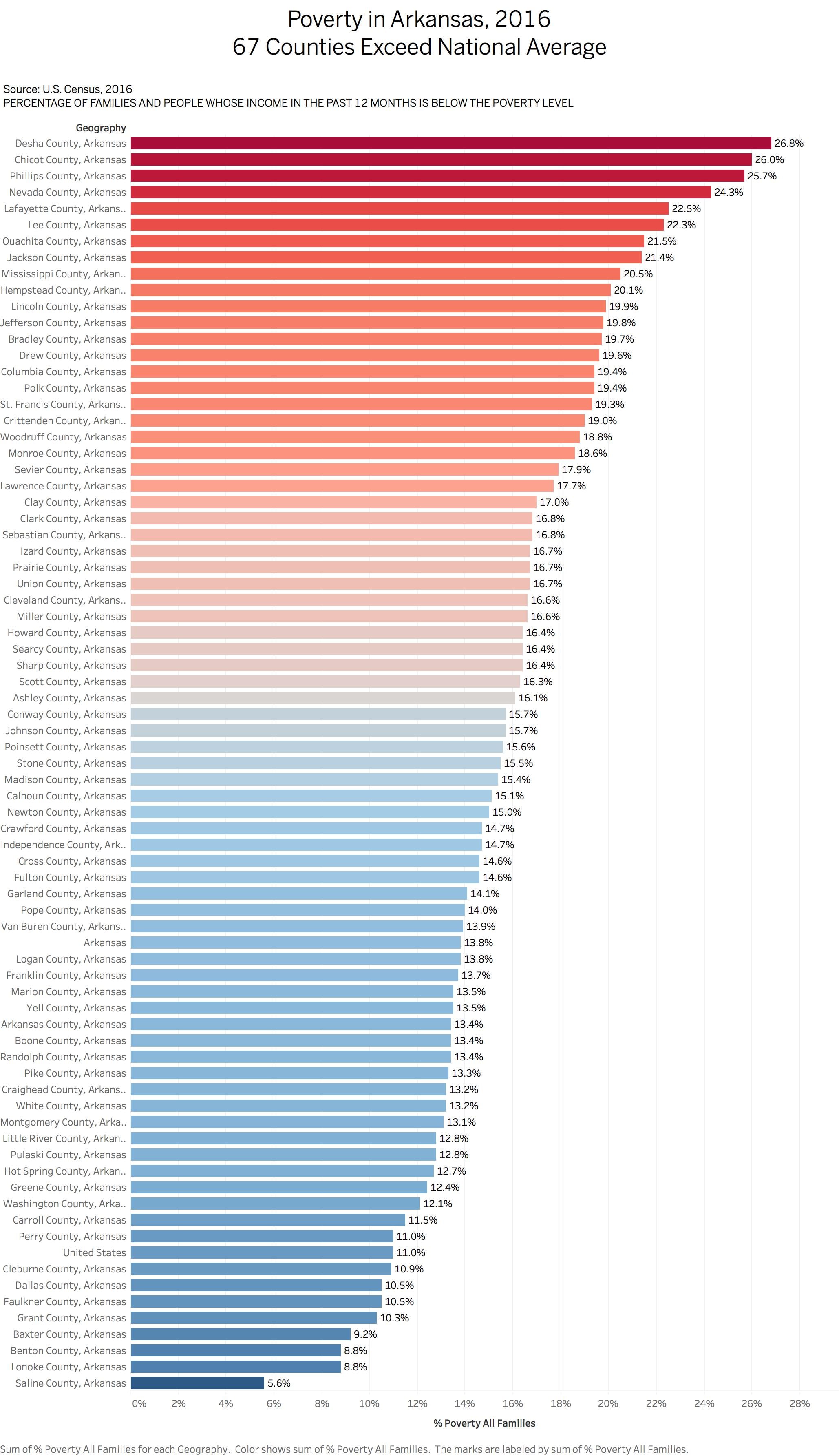
Task #2: Poverty Level Chart
Following the same steps as above, create a simplified spreadsheet with these data sources. You’ll find this data on the tab “ACS_16_5YR_DP03_with…”
#1
HC03_VC161 Percent; PERCENTAGE OF FAMILIES AND PEOPLE WHOSE INCOME IN THE PAST 12 MONTHS IS BELOW THE POVERTY LEVEL – All families
#2
HC03_VC169 Percent; PERCENTAGE OF FAMILIES AND PEOPLE WHOSE INCOME IN THE PAST 12 MONTHS IS BELOW THE POVERTY LEVEL – Families with female householder, no husband present – With related children of the householder under 18 years – With related children of the householder under 5 years only
Produce a statewide chart and a chart filtered for our six counties in NW Arkansas
Bobby Ampezzan

Bobby Ampezzan is a native of Detroit who holds degrees from Dickinson College (Carlisle, PA) and the University of Arkansas (Fayetteville). He’s written for The Guardian newspaper and Oxford American magazine and was a longtime staff writer for the Arkansas Democrat-Gazette. The best dimestore nugget he’s lately discovered comes from James Altucher’s Choose Yourself: “I lose at least 20 percent of my intelligence when I am resentful.” Meanwhile, his faith in public radio and television stems from the unifying philosophy that not everything is serious, but curiosity should follow every thing, and that we all should be serious about curiosity.
Examine Arkansas Public Media’s website. Look at the background of Bobby Ampezzan, the organization’s funding and how they published two School of Journalism projects:
http://arkansaspublicmedia.org/
http://arkansaspublicmedia.org/post/more-arkansas-veterans-face-suicide-risk-homelessness
http://arkansaspublicmedia.org/post/student-journalists-give-va-good-grade-veteran-homelessness-suicide-cause-alarm
http://arkansaspublicmedia.org/post/housing-loans-difficult-most-northwest-arkansas-minorities
http://arkansaspublicmedia.org/post/ua-database-journalism-digs-home-mortgages-race-discoversits-complicated
Task #3: Download Census Demographic data
Household income data for counties and state and national. Gender and demographics of low-wage workers
American FactFinder
https://factfinder.census.gov/faces/nav/jsf/pages/index.xhtml
Advanced Search | Show Me All
Topics | People | Poverty
Geographies | County | Arkansas | All Counties Within Arkansas
Select Table S1701, Poverty Status in the Past 12 Months
Modify Table
—Select top Filter
—Total and Percent Below Poverty Level
—Select second Filter
—Keep Estimate, do not check margin of Error
Download
—Use the Data
Download Again
—View the Data
—Excel spreadsheet
Video on Factfinder
30:00 shows how to use the fact finder
https://www.census.gov/data/training-workshops/recorded-webinars/measuring-america.html
Data Cleaning Census spreadsheets.
–Download the view and the data versions of large spreadsheets. One to guide you. the other to do the work.
–Merge / unmerge cells
–Find-Replace
— =CONCATENATE(B3, B4).
Cleaned and download 2011-2015 estimates with detailed poverty metrics
Ark Counties full income search 5-10-17 ACS_15_5YR_DP03
Narrative Journalism: “The Holdouts”
Examine this article for how the writer uses detail and sets a scene.
Identify specific elements the writer used to set the scene
Examine how she describes cigarettes.
The writer uses the brands to describe cigarettes – what does that do to the story?
Specify the ways that cigarette pricing is discussed
How does the writer convey the notion of stigma?
How does she describe the community of smokers?
How is quitting used as a sub-theme?
What is the purpose of telling the stories of how people came to smoke?
Occupational Employment Data
Arkansas
https://www.bls.gov/oes/current/oes_ar.htm
NW Arkansas
https://www.bls.gov/oes/current/oes_22220.htm
- Identify jobs paying $9.50 an hour or less.
Gender and racial diversity in newsrooms. Note the animation
AP Stylebook Entry on Data Journalism
Data Journalism
Data sources used in stories should be vetted for integrity and validity. When evaluating a data set, consider the following questions:
–What is the original source for the data? How reliable is it? Can we get answers to questions about it?
– Is this the most current version of the data set? How often is the data updated? How many years of data have been collected?
–Why was the data collected? Was it for purposes of advocacy? Might that affect the data’s reliability or completeness? Does the data make intuitive sense? Are there anomalies (outliers, blank values, different types of data in the same field) that would invalidate the analysis?
–What rules and regulations affect the gathering (and interpretation) of the data?
–Is there an alternative source for comparison? Does the data for a parallel industry, organization or region look similar? If not, what could explain the discrepancy?
–Is there a data dictionary or record layout document for the data set? This document would describe the fields, the types of data they contain and details such as the meaning of codes in the data and how missing data is indicated. If the data collectors used a data entry form, is the form available to review? For example, if the data entry was performed by inspectors, is it possible to see the form they used to collect the data and any directions they received about how to enter the data?
Data and the results of analysis must be represented accurately in stories and visualizations. Any limitations of the data must also be conveyed. If one point in the analysis is drawn from a subset of the data or a different data set altogether, explain why this was done.
Use statistics that include a meaningful base for comparison (per capita, per dollar). Data should reflect the appropriate population for the topic: for example, use voting-age population as a base for stories on demographic voting patterns. Avoid percentage and percent change comparisons from a small base. Rankings should include raw numbers to provide a sense of relative importance.
When comparing dollar amounts across time, be sure to adjust for inflation. When using averages (that is, adding together a group of numbers and dividing the sum by the quantity of numbers in the group), be wary of extreme, outlier values that may unfairly skew the result. It may be better to use the median (the middle number among all the numbers being considered) if there is a large difference between the average (mean) and the median.
Correlations should not be treated as a causal relationship. Where possible, control for outside factors that may be affecting both variables in the correlation. Use round numbers where possible, particularly to avoid a false appearance of precision. Be clear about limitations of sample size in reporting on data sets. See the polls and surveys section for more specific guidance on margin of error.
Try not to include too many numbers in a single sentence or paragraph.
Homework
Reading:
Meyer, “New Precision Journalism,” Ch. 1-2
Class Matters (Intro, Ch 1)
Post the following on a blog by 11:59 pm Tuesday, Feb. 6:
On New Precision Journalism, post two questions about material you didn’t understand and want to review in class. Also post about something you liked.
On Class Matters, do you buy the New York Times argument about the importance of class in the modern debate about income inequality? Yes or no.
Interview: Two paragraphs with the name, age, position and some details about your interview subject. Include some good quotes. Write this as you would a news story. Look at the OES database and find the median salary for this occupation.
Data: Finish Task #2, Poverty Charts
–Statewide trends for Arkansas.
–Northwest Arkansas counties
–Statewide trends for female households
–Northwest Arkansas counties female households.
Advanced Research
https://wordpressua.uark.edu/datareporting/advanced-research/