Agenda
–Principles of Data Visualization
–Occupational Employment Data
–Mapping #1: Build a Map in Google Fusion Tables
–Tableau and calculations. Reference Line in Tableau
–Audio recording and editing skills.
Principles of Data Visualization
How to Represent Your Data
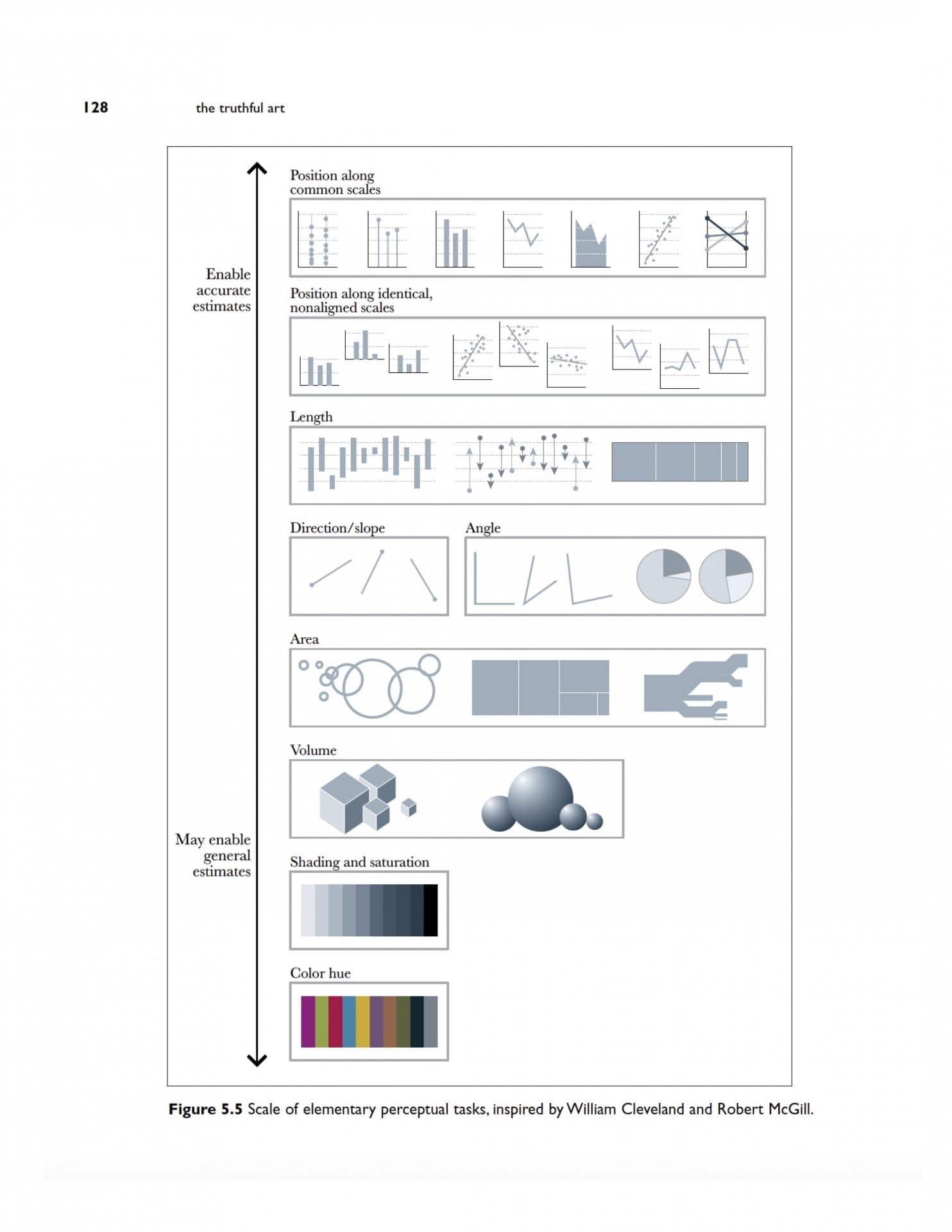
Cleveland McGill Scale
Dataviz Catalog
FT Visual Vocabulary
Build a Map in Google Fusion Tables
Download FBI Data and Map Crime Rates
Fusion Table
https://www.google.com/fusiontables/DataSource?docid=1xaT29A1j-Mr3u9X70X9CB6mrN_2WjzAxRFiiSmTO
https://www.google.com/fusiontables/DataSource?docid=1IHXqRKZiXStuRpelBDpPGbYw7sVTG8oXwMnHGsCN
Occupational Employment Data
Arkansas
https://www.bls.gov/oes/current/oes_ar.htm
NW Arkansas
https://www.bls.gov/oes/current/oes_22220.htm
- Identify jobs paying $9.50 an hour or less.
Gender and racial diversity in newsrooms. Note the animation
Class Occupational Employment Data
Arkansas
https://www.bls.gov/oes/current/oes_ar.htm
NW Arkansas
https://www.bls.gov/oes/current/oes_22220.htm
- Identify jobs paying $9.50 an hour or less.
- Sort by the largest number employed in this category
Compare to
- Identify jobs paying $9.50 an hour or less.
- Sort by the largest number employed in this category
- Compare to state.
Create a Reference Line for Poverty
Step 1 – Build the View
- Drag % Female Households – Children 5 Years to the Rows shelf.
- Drag Geography to the Columns shelf.
Step 2 – Create Parameters
- Right-click in the Data pane and then select Create Parameter.
- Name the parameter “Arkansas Average”.
- Under Data Type select Integer.
- Under Current Value, set to 55.8
- Under Allowable values select All.
- Click OK.
Step 3: Create the calculated field
- Select Analysis > Create Calculated Field.
- Name the calculated field “Reference Line”.
- In the formula field, enter the following formula:
- IF[% Female Households – Children 5 years younger]=[Arkansas Average] THEN [Arkansas Average] END
- Click OK.
Step 4 – Use the calculated field as a Parameter Control
- Drag the “Reference Line “calculated field to Details. This is the box below Color in the Marks Card
- Click the arrow to change the measure from SUM to Minimum.
- In the view, right-click on the Y axis and select Add Reference Line.
- In the Value drop down menu, select Minimum(Reference Line).
- In the Label drop-down menu, select Value.
- Click OK.
Homework
Reading Below on Data Diaries
Albert Cairo, The Truthful Art, Ch. 3 Chapter3TheTruthfulArt-2nw36qt
Cohen “Numbers in the Newsroom” p. 50-58. Averaging Averages. Weighted Averages. Standard Deviation; ch. 3,Working With Graphics.
Data Diary Examples
2) Christian McDonald
Oh, do I have feelings about this one…
I keep a data diary for myself that has everything from notes about public information requests, notes about where I got data, descriptions of what I did, sql queries and all kinds of things. I sometimes also make a data report that is really RESULTS of what I learned, as opposed to how I got there in the data diary. The data report is more for other reporters, editors and maybe sources, but the diary is for me, so less formal.
These days I’m trying to script more of my work using Jupyter Notebooks, which then tends to be a mix of the two. It has info about where the data came from and the code that made the result. Sometimes it is written for future me, sometimes for the public. Generally, I’ll still keep a personal data diary just for my future self, ‘cause I can’t remember what I did yesterday much less last week.
Data diaries I tend to write in markdown files on my machine so code doesn’t get wigged with curly-quote translations. Data reports are typically Google Docs or Jupyter Notebooks on Github.