Agenda for Monday, Oct. 8
–Context!
–Common Errors
Context #1
Add the Quick Facts for city population, demographics.
Little Rock: African American comprise 42 percent of Little Rock’s population. https://www.census.gov/quickfacts/fact/table/littlerockcityarkansas,US/PST045217
Add typical salary from Occupational Employment Statistics database for Arkansas
https://www.bls.gov/oes/current/oes_ar.htm
Common Errors – Math
Percent vs Percentage Point
At Lyon College, 67 percent of non-first-generation students paid back their loans within five years, while only 53 percent of first-generation students did the same, which results in a 14 percent POINT difference. The median debt for both types of students was the same though, at $12,000.
You mean “percentage point.” 14 percent of 67 is 9.4.
Steve Doig – MathCrib-Doig
Common Errors – AP Style on Numbers
AP Style on Numerals:
Numerals – AP Stylebook-2avrxtn
Common Error – Divi Library
Divi Builder. Do Not Save to Library.
Context #2: Build Charts for Context
First row: The overall median debt for Arkansas students; for men, for women.
Second row: The overall median debt for first generation students. And non-first generation
Third row: The overall statewide repayment rate, and the rate for men, for women
Fourth row: The overall median debt for white, black, asian, hispanic
Post on WordPress with the category Context
Research – Data Question
The Financial Aid department does not report loan repayment info to the Department of Education. “Once the students leave us we don’t track their information anymore,” he said.
Question: Look at data dictionary for source of this information. All 1,826 columns explained here.
https://collegescorecard.ed.gov/assets/FullDataDocumentation.pdf
https://collegescorecard.ed.gov/assets/CollegeScorecardDataDictionary.xlsx
Homework
#1: Read this report and compare to your work on context. Prepare to discuss it Wednesday
https://ticas.org/sites/default/files/pub_files/classof2016.pdf
#2: By 11:59 p.m. Tuesday, fix the issues with your charts and stories from Assignment #2. Post on WordPress, use the Context category for a tag
Q’s for Schleuss- Katie Serrano
- When I think of data journalism, I think of long, investigative pieces that usually cover more serious of conflict-related issues. While that may be the case the majority of the time, how does someone in your position also go about pitching more “light-hearted” story ideas still using data/extensive graphics such as your Disney land piece? In your opinion, why is data and graphics in a piece like that important?
- What are more advanced graphic tools/programs students and graduates should know how to use if they want to get their foot in the door of the data journalism world?
Katie Serrano and Elisabeth Butler
Mary's Nicosia Interview
Donkey
Class 6: Feb 22, 2018
Terry Gross On Interviewing
______________________________________________________________________________________________________________________
Gear
Using the Zoom H4N Recorder
https://snapguide.com/guides/use-a-zoom-h4n-handy-recorder/
Editing audio
Not so free software: Adobe Audition
______________________________________________________________________________________________________________________
Adobe Audition Editing Drill
File | Import | Filename .. xxx.wav
Play audio. Controls at bottom.
Expand view — Magnifying glass: Zoom In – Time
Define / Highlight section to cut.
Edit | Cut
Save As New File – Adobe Audition File
Export as an .wav file.
Sample Rate: 44100. Stereo. 24 bits.
Assign correct folder
Fade in and Fade out Audio
https://helpx.adobe.com/audition/how-to/audition-add-audio-fades-cc.html
______________________________________________________________________________________________________________________
Free software for your laptops
https://www.audacityteam.org/download/
Jon Schleuss – March 1
______________________________________________________________________________________________________________________
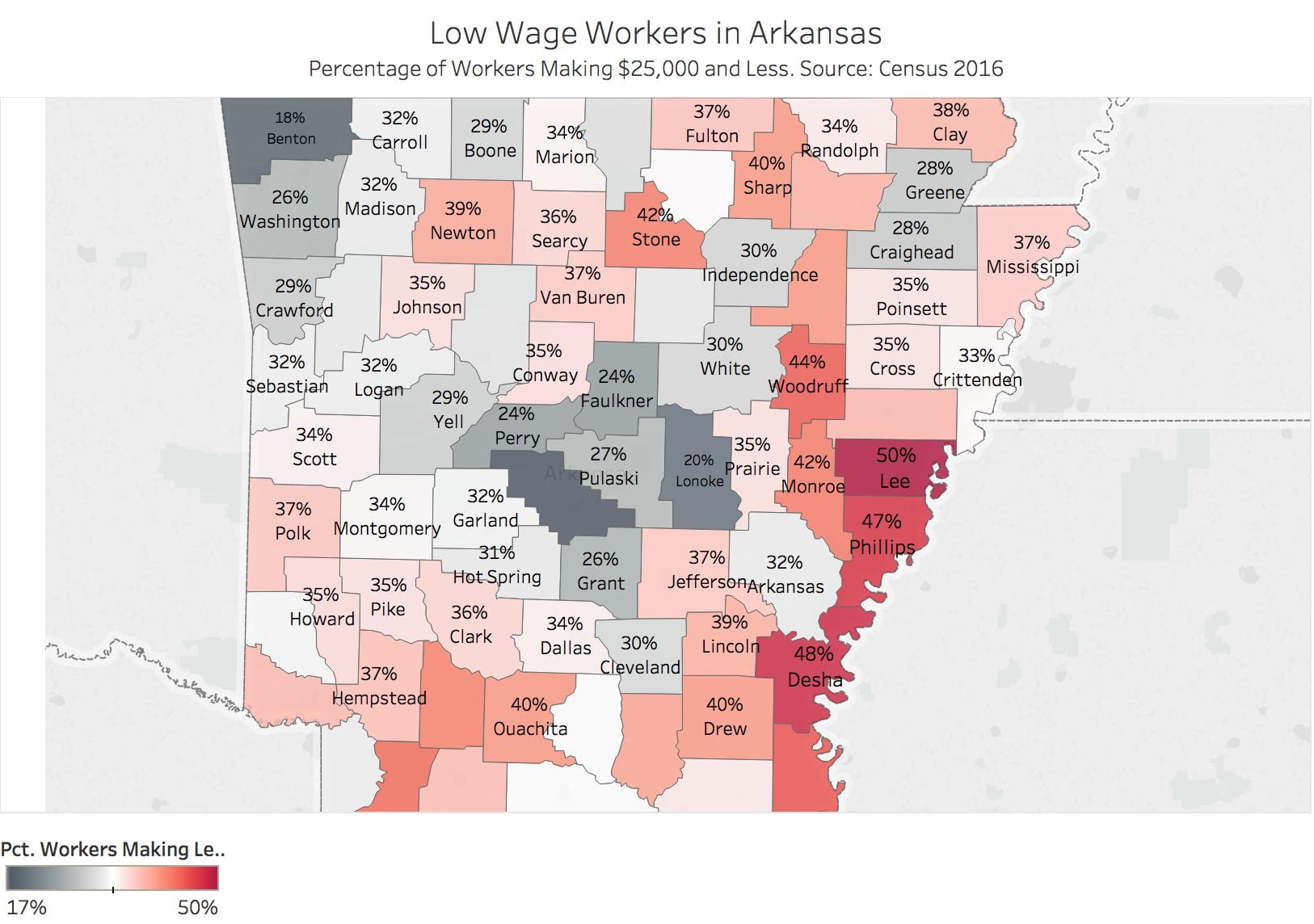
Map Low Wage Workers in Arkansas
Use US Ark Counties Poverty ACS_16_5YR_DP03 – Poverty Income
In Dimensions, copy Geography (cntl + click, duplicate). Rename Geography1
Then convert the data to Geography
–Geographic Role | Counties
Drag Geography1 to Columns. % Total Under 25k to Rows
Select Map Icon under Show Me.
You should have the state of Arkansas and dots within the borders.
Not all show up! To fix:
Top Menu Bar:
Map | Edit Locations | State – Change to Arkansas
Magic!
(Arkansas and United States don’t show up – deal with that later)
Color, Label, Format, Name counties.
Marks | Maps will fill out the geographies.
Fiddle, Tweak, Obsess
Fiddle, Tweak, Obsess
Fiddle, Tweak, Obsess
______________________________________________________________________________________________________________________
Mapping in Tableau

______________________________________________________________________________________________________________________
Create a Reference Line for Poverty
Use the US Ark Counties Poverty ACS_16_5YR_DP03 data – the income-poverty data.
Fire up Tableau
Step 1 – Build the View
- Drag % Female Households – Children 5 Years to the Rows shelf.
- Drag Geography to the Columns shelf.
Step 2 – Create Parameters
- Right-click in the Data pane and then select Create Parameter.
- Name the parameter “Arkansas Average”.
- Under Data Type select Integer.
- Under Current Value, set to 55.8
- Under Allowable values select All.
- Click OK.
Step 3: Create the calculated field
- Select Analysis > Create Calculated Field.
- Name the calculated field “Reference Line”.
- In the formula field, enter the following formula:
- IF[% Female Households – Children 5 years younger]=[Arkansas Average] THEN [Arkansas Average] END
- Click OK.
Step 4 – Use the calculated field as a Parameter Control
- Drag the “Reference Line “calculated field to Details. This is the box below Color in the Marks Card
- Click the arrow to change the measure from SUM to Minimum.
- In the view, right-click on the Y axis and select Add Reference Line.
- In the Value drop down menu, select Minimum(Reference Line).
- In the Label drop-down menu, select Value.
- Click OK.
______________________________________________________________________________________________________________________
Homework
—Post two questions for Schleuss here.
–Fix your graphics so I can send them to Schleuss and Ampezzan this weekend. Email me when you’re done
—Finish Assignment #2 : Due 11:59 p.m. Wednesday, Feb 28. Post on WordPress.
Questions for Jon Schleuss
Post Your Questions for Jon Schleuss Here
https://www.latimes.com/la-bio-jon-schleuss-staff.html
Hi Jon, I want to know….What map program do you use? How did you learn it — YouTube or a class?
Thanks, Rob Wells
Butler – Blog Post 2/20
- One thing I learned from these blog posts is that you need to be consistent. I liked that he said you can’t compare the auto accidents in Chicago and Lincoln, NE, that’s just not fair. To represent data in a fair way, you need to either find two comparable data sets to analyze, or make two unlike data sets comparable using simple math. Another thing I learned is that visualization is essentially the key to welding patterns and storytelling together. It not only confirms the data and that there is a pattern, but left with just the visualization alone there is a story to be told.
- I learned the importance of communicating terms up front – and never assuming that the same goals are attempted. I also learned that one source can lead to another, and another and that there are networks made just by interviewing one source. I also learned that there are relationships to be built in each individual interview and to treat those ethically the same, but all differently in a way.
- We spoke about the tardiness of my assignment due to personal circumstances, and I have not received feedback yet!
Mary Kerr Winters – Blog Post 5
1)–Based on the Cairo and Cohen readings, what are one or two things you want to try with your data visualizations going forward? What did you learn about info graphics.
- To further improve my data visualizations going forward, I want to learn how to apply controls to the data when comparing certain populations and situations. For example, knowing how to generate a relative variable to a graph that needs to make the numbers related and fair to one another. (ex: ratio/population) There is most likely an outlier sometimes, and instead of settling with the outlier like I normally would do, I want to make sure that the outlier is fair and accurate when comparing it to the rest of the data.
- I also want to be able to analyze a visualization better to make it the truest model it can possibly be because that is the most important point, isn’t it? Truth. Cairo encourages to always ask yourself “compared to whom, to what, to when, to where…etc.” when creating a visualization. I forget to ask these simple questions, and they can really aid your data visualization in the most important aspect.
2) –Based on the interviewing readings, what new techniques did you learn to help with these interviews of low income workers?
- Preparing big time before the interview. Truthfully, I did not realize how important it is to prepare before the interview. Identifying the “stakeholders, storytellers, audience, and other experts.” I need to know my surroundings and the people involved in those environments in order to get a clear and truthful interview with someone. I really want to work on analyzing my surroundings more and be as detailed as possible.
- I am a talker. I love to talk a lot and try to relate myself to people as much as possible. I think it is a kind of comfort mechanism for me, but when interviewing I need to shut up and listen. This is something I am going to have to train myself to hold my tongue and listen. “Ask short and direct questions and listen!”
- I get afraid to dive deep as well because I am intimidated that I might be overstepping boundaries, but the interviewing tips about how to approach people with phrases like “Tell me more about that” is extremely helpful with not sounding too forceful.
- I need to just be confident in this process and get to the know the interviewee as much as I can. After reading these tips, I am more excited and feel more comfortable about going out there and starting the interview process.
3) – My revisions were made on the original post.
Aubry Tucker blog post 4
Blog Post 2.20.18- Ann Claire Johnson
Ann Claire Johnson
Advanced Reporting and Data Analysis
Blog Post Due 2.20.18
Blog Post: Due 11:59 pm Tuesday Feb 20
1)–Based on the Cairo and Cohen readings, what are one or two things you want to try with your data visualizations going forward? What did you learn about info graphics.
- I want to try more map graphics. I enjoyed seeing that on page 77 of Cairo’s article and I found it interesting when we did it last class as well. I would like to test the theory of apophenia in a graph and see if anyone notices. I would also like to exemplify logic, statistics, and experiments in future graphs in the most efficient way possible.
- I learned that, “The more adequately a model fits whatever it stands for without being needlessly complex, and the easier it is for its intended audience to interpret it correctly, the better it will be” (Cairo, 70). This wasn’t necessarily news to me but it did remind me that just because the graph looks complex and hard, doesn’t mean that it’s an impressive graph. This is helpful when thinking about future tableau presentations.
- Another thing that I learned is that the larger and medium sized news organizations in the United States have been in decline in the past few years. (Just news publications?) The reason for this is that there are shrinking circulations and audiences, (maybe because reading this newspaper isn’t trendy) as well as diminishing ad revenue.
- I also learned about patternicity and apophenia. I haven’t ever heard these terms before but I am excited that there is a word for each because the instances in which they are relevant is totally relatable.
- I found this quote very helpful; “Don’t rush to write a headline or an entire story or to design a visualization immediately after you find an interesting pattern, data point, or fact. Stop and think. Look for the other sources and for people who can help you escape from tunnel vision and confirmation bias. Explore your information at multiple levels of depth and breadth, looking for extraneous facts that may help your findings. Only then can you make a decision about what to say, and how to say it, and about what amount of detail you need to show to be true to the data” (Cairo, 94). The reason why I found this helpful is because I am an immediate gratification type of journalist. Every time I find something that satisfies me when I’m reporting on or writing about a topic, I write about it immediately without further investigation about the rest of the topic.
2) –Based on the interviewing readings, what new techniques did you learn to help with these interviews of low income workers?
- In the “Getting the Goods—Interviews that Work” article by Jaqui Banaszynski I found the most help for my interviewing tips and techniques. The first two points, reveal emotion and character and then create partners, was something that I needed to be reminded of because I am not as savvy as an interviewer as I would like to be. In reference to point 1. I need to; ask not how people feel (or think) but what they do, ask specific moments or actions, and put questions into a frame. I also need to focus on coming off as invested in the person that I’m interviewing and not just the content that I am collecting by interviewing them. I also really need to work on slowing down and shutting up when I interview. I do feel like, in reference to 11., I am not afraid to ask about things that I don’t understand. When I interview my low income worker I will also refer to the article “Interviewing With Courage and Creativity” by Jacqui Banaszynski, and use it as almost a rubric or an outline/checklist for before my interview, during, and after my interview. I am really glad you included this article because it was detailed and will help with my organization throughout my interviewing process.
3) –Fix issues with your assignment #1 based on my comments. You will revise that Assignment #1 post.
Assignment 1 Final- Ann Claire Johnson
Ann Claire Johnson
Assignment 1- Final
2.22.18
Advanced Reporting and Data Analysis
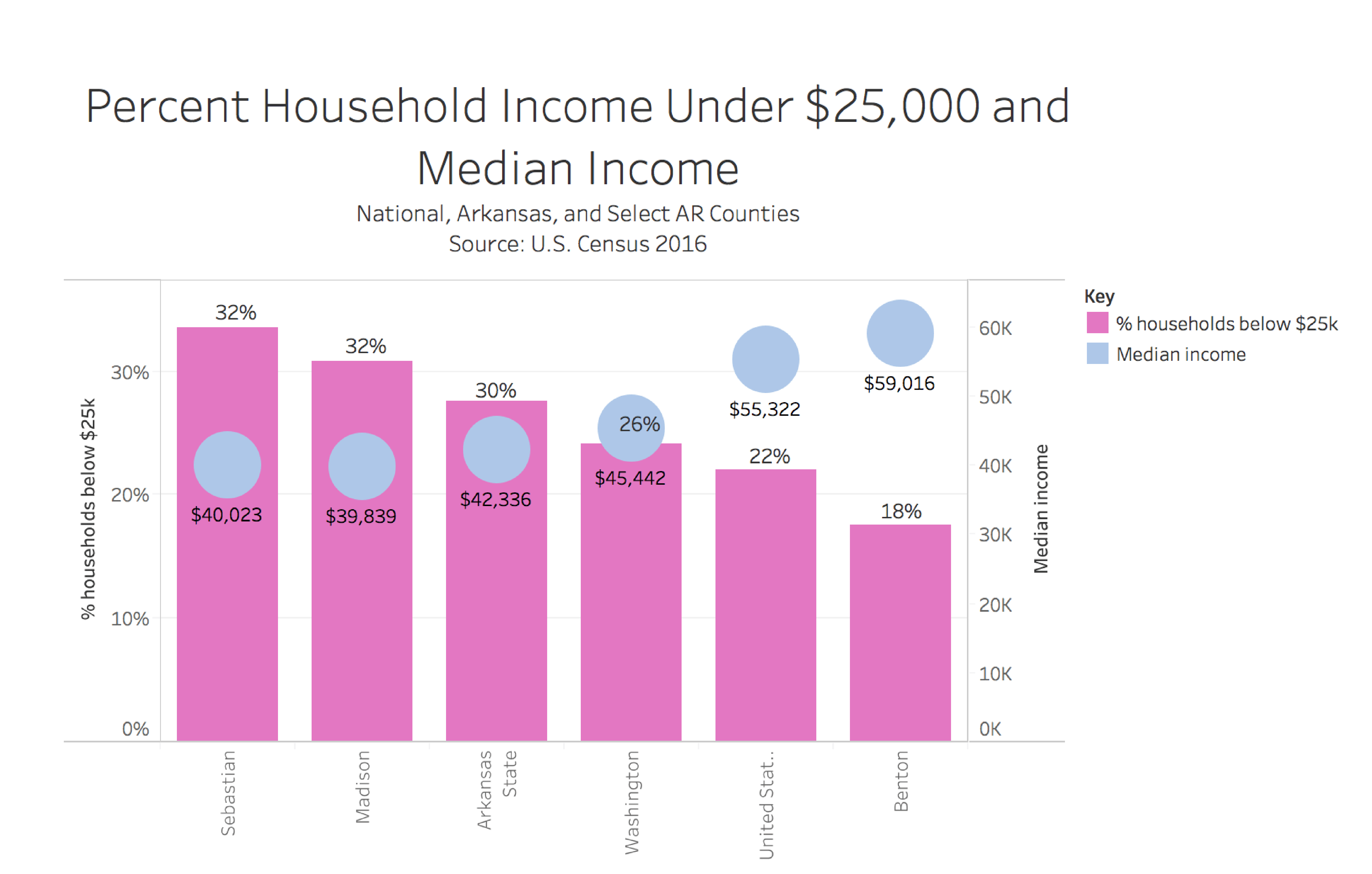
Poverty consumes Arkansas’s population more than what is brought to our attention. After observing most recent economic statistics based on poverty in counties throughout Arkansas, I have discovered that in some Arkansas counties over a quarter of that county’s population has an income of under $25,000. This first graph compares the percentage of households with an income under $25,000 a year to the median household income per county. The counties that have the highest percentage of households whose income is below $25,000 a year also have the lowest median household income. In Sebastian and Madison County, where roughly 32 percent of the households in each county have incomes below $25,000 a year, the median household income is around $40,000 a year. Benton County consistently stands out throughout all of the graphs. Benton County has the lowest percentage of households whose income is below $25,000 a year. Benton County then also has the highest median income at $59,016, which is on average $3,000 more than what the median income for the United States as a whole.
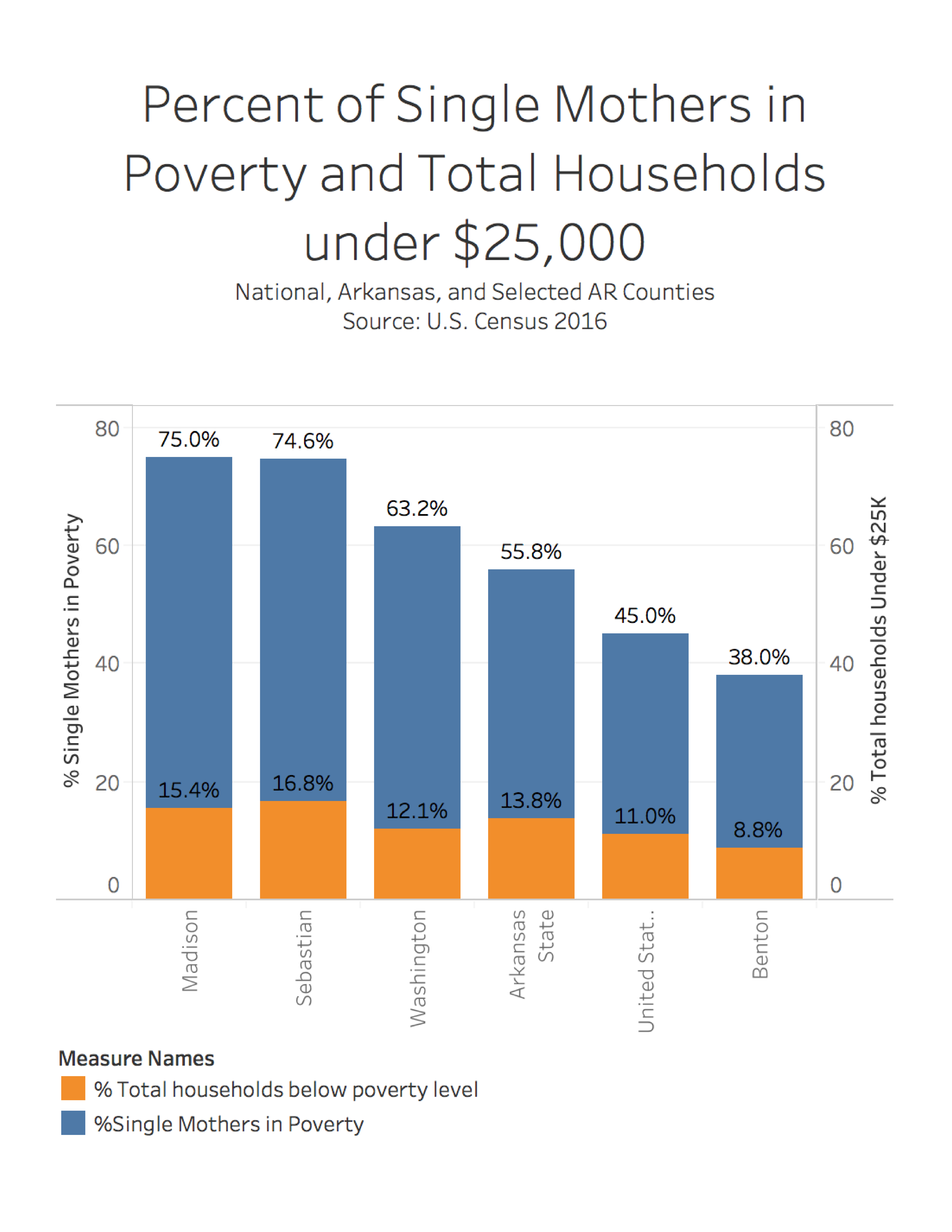
The graph below shows the statistics on the comparison of single-mother households that are in poverty in Arkansas counties versus total households below poverty level. What is so alarming about this graph is that the single mother factor is what makes the difference in poverty in these Arkansas counties. Even in Benton County there is a large jump from 8.8 percent of households below poverty level to 38 percent of single mother households being in poverty.
This graph represents the percentage of people that are employed in poverty. Benton County has the lowest percentage amount of people employed in poverty, 4.9 percent. The highest percentage amount of people employed in poverty are in Washington County, 11.4 percent. The United States had the second to lowest percentage of people that suffer from poverty but are also employed.

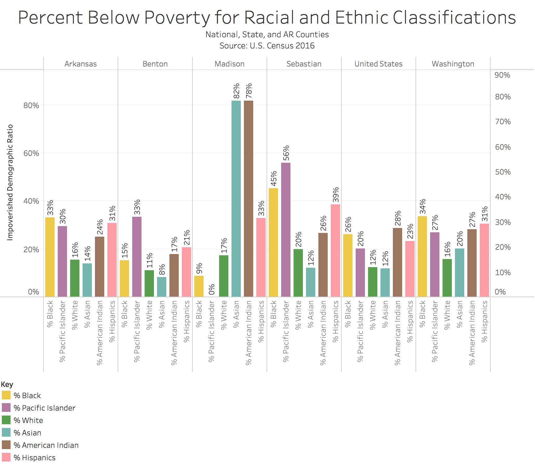
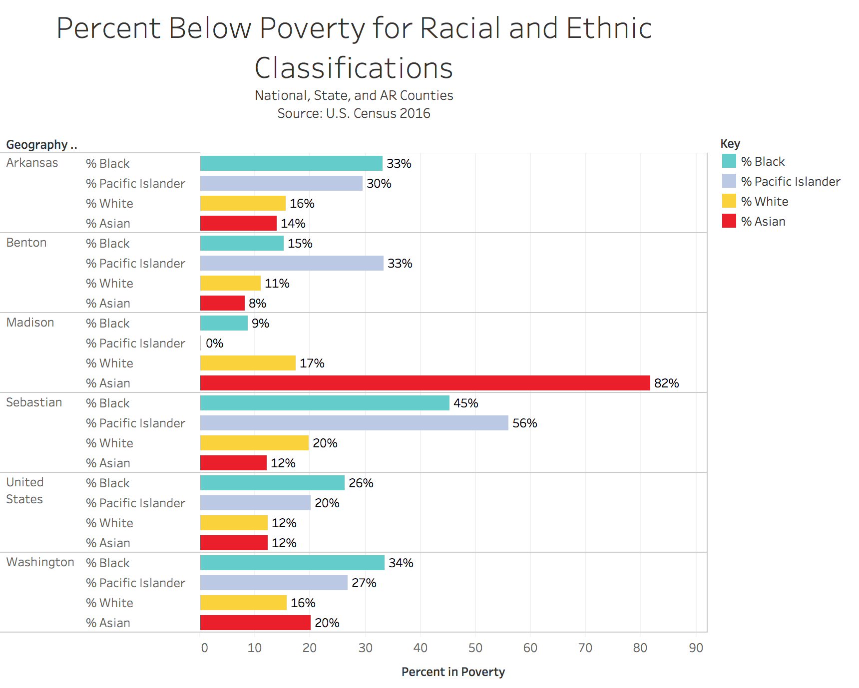
This last graph represents the association of the percentages of people based on their racial and ethic background to where they live. The strangest thing about this graph is that in Madison County, the Asian population has the largest percent below poverty level. This contrasts all of the other Asian percentages in the other counties.
Blog Post 4 Katie Serrano
- After reading Cairo, one sort of graphic that I look forward to learning how to make is a percentage change graphic. I think it is a good visual and helps explain a more ambiguous set of numbers and statistics that a reader doesn’t see every day. I also learned the importance of the headline when Cairo talked about the grad school and job prospect survey. Journalists can almost twist the meaning of a story in their favor if they aren’t careful.
- One thing when interviewing that I need to work on is “for every one question ask 5 more.” I usually try to go into an interview very organized and with a set of questions that I want to make sure I hit, and while that is important I need to also make sure that the story is going in the right direction and have flexibility that it might change. I also haven’t had much experience interviewing people in their “natural habitats” or on the job in action, but for this project it will be important to set the scene of the employees working so I will need to make sure I am more observant and incorporate their surroundings into the story.
- See updated post