Agenda for Monday, Oct. 8
–Context!
–Common Errors
Context #1
Add the Quick Facts for city population, demographics.
Little Rock: African American comprise 42 percent of Little Rock’s population. https://www.census.gov/quickfacts/fact/table/littlerockcityarkansas,US/PST045217
Add typical salary from Occupational Employment Statistics database for Arkansas
https://www.bls.gov/oes/current/oes_ar.htm
Common Errors – Math
Percent vs Percentage Point
At Lyon College, 67 percent of non-first-generation students paid back their loans within five years, while only 53 percent of first-generation students did the same, which results in a 14 percent POINT difference. The median debt for both types of students was the same though, at $12,000.
You mean “percentage point.” 14 percent of 67 is 9.4.
Steve Doig – MathCrib-Doig
Common Errors – AP Style on Numbers
AP Style on Numerals:
Numerals – AP Stylebook-2avrxtn
Common Error – Divi Library
Divi Builder. Do Not Save to Library.
Context #2: Build Charts for Context
First row: The overall median debt for Arkansas students; for men, for women.
Second row: The overall median debt for first generation students. And non-first generation
Third row: The overall statewide repayment rate, and the rate for men, for women
Fourth row: The overall median debt for white, black, asian, hispanic
Post on WordPress with the category Context
Research – Data Question
The Financial Aid department does not report loan repayment info to the Department of Education. “Once the students leave us we don’t track their information anymore,” he said.
Question: Look at data dictionary for source of this information. All 1,826 columns explained here.
https://collegescorecard.ed.gov/assets/FullDataDocumentation.pdf
https://collegescorecard.ed.gov/assets/CollegeScorecardDataDictionary.xlsx
Homework
#1: Read this report and compare to your work on context. Prepare to discuss it Wednesday
https://ticas.org/sites/default/files/pub_files/classof2016.pdf
#2: By 11:59 p.m. Tuesday, fix the issues with your charts and stories from Assignment #2. Post on WordPress, use the Context category for a tag
Blogpost 2/20/28 – Andrew Epperson
1. Based on the Cairo and Cohen readings, there are certainly several things I’d like to be able to do with my data visualizations going forward. To start off, I really didn’t understand the basics of data visualizations in the first place until I really started doing some researching on my own, asking for help from some of my classmates and visiting Prof. Wells during office hours. Now that I feel comfortable putting together graphics, I want to ease in and make sure I can continue to follow the basic procedures. When I do reach a certain point, though, I’d like to create a graphic that compares the Razorback men’s basketball team’s three-point percentage on the road versus in Bud Walton Arena. When I get the correct information formatted, I’d like to put it into a graph that is both understandable and aesthetically pleasing to an average reader.
Secondly, I hope to begin implementing graphics in my work for the Traveler and Democrat-Gazette. While I believe it would be easy to do for the Traveler, I’m not sure if I could include them in the Democrat-Gazette or not. Regardless, I would love to start using them in my work.
Prior to studying the readings, I never thought about the relationship between a reader and printed graphics. I generally take sports graphics at face value when I see them, because I typically stick to ESPN when it comes to reading sports articles. While there are other sites that use statistics in much more in depth ways, ESPN seems to keep numbers out of their stories unless they are presented in a certain way. I never realized that graphics could mislead a reader in a way that skewed facts and packaged them as pure truths. In the same way, I didn’t think about how easy it can be to misrepresent information without even knowing it. That puts the onus on me to make sure my stuff is as accurate as it can be, especially since I’m just now grasping the basics of data reporting. That’s no excuse for misrepresentation of facts.
2. Based on the interview readings, I learned several ways I can interview low-income workers. Instead of asking them about how they feel about certain things, which is something I have the tendency to do, I should focus on tangible questioning. “What did you do in this situation? How did you react to this? What did you do next?” I also learned that objects and props can play a role in interviewing, as questions about certain artifacts could spark good interview answers. While I’ve had to tap into my own humanity during the executions and tornado coverages I did last spring, this will be a different level of empathy I need to try and reach to make the subject comfortable. That’s something I need to practice and figure out how to implement during interviews.
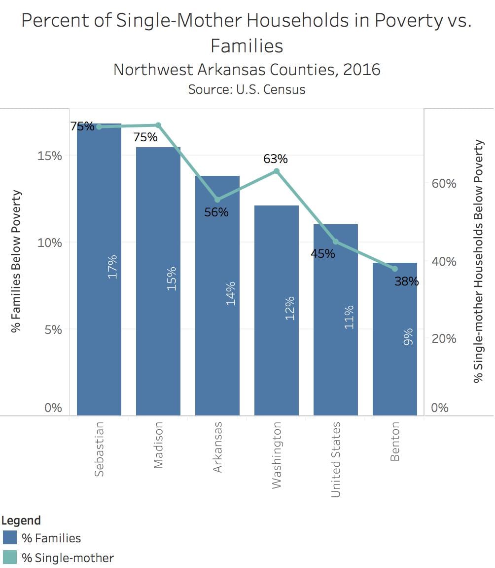
Butler – Assignment #1
The trends in poverty throughout Northwest Arkansas Counties are inconsistent throughout many diverse situations.
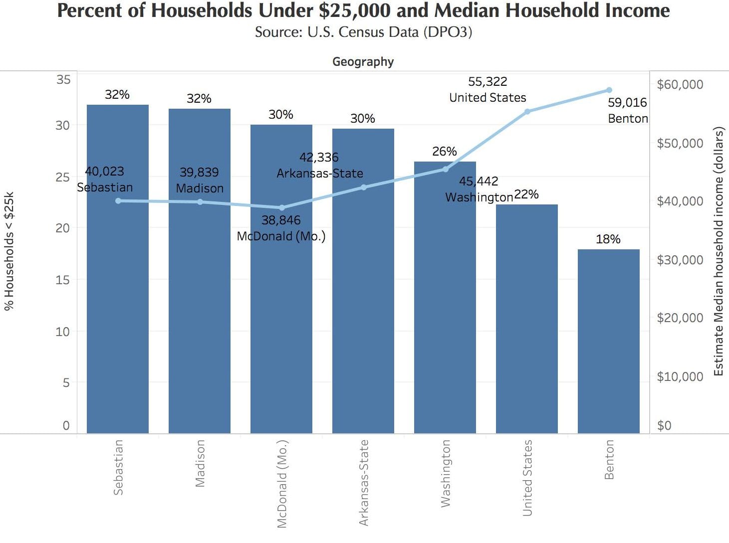
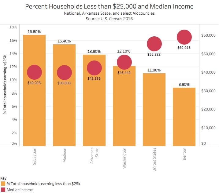
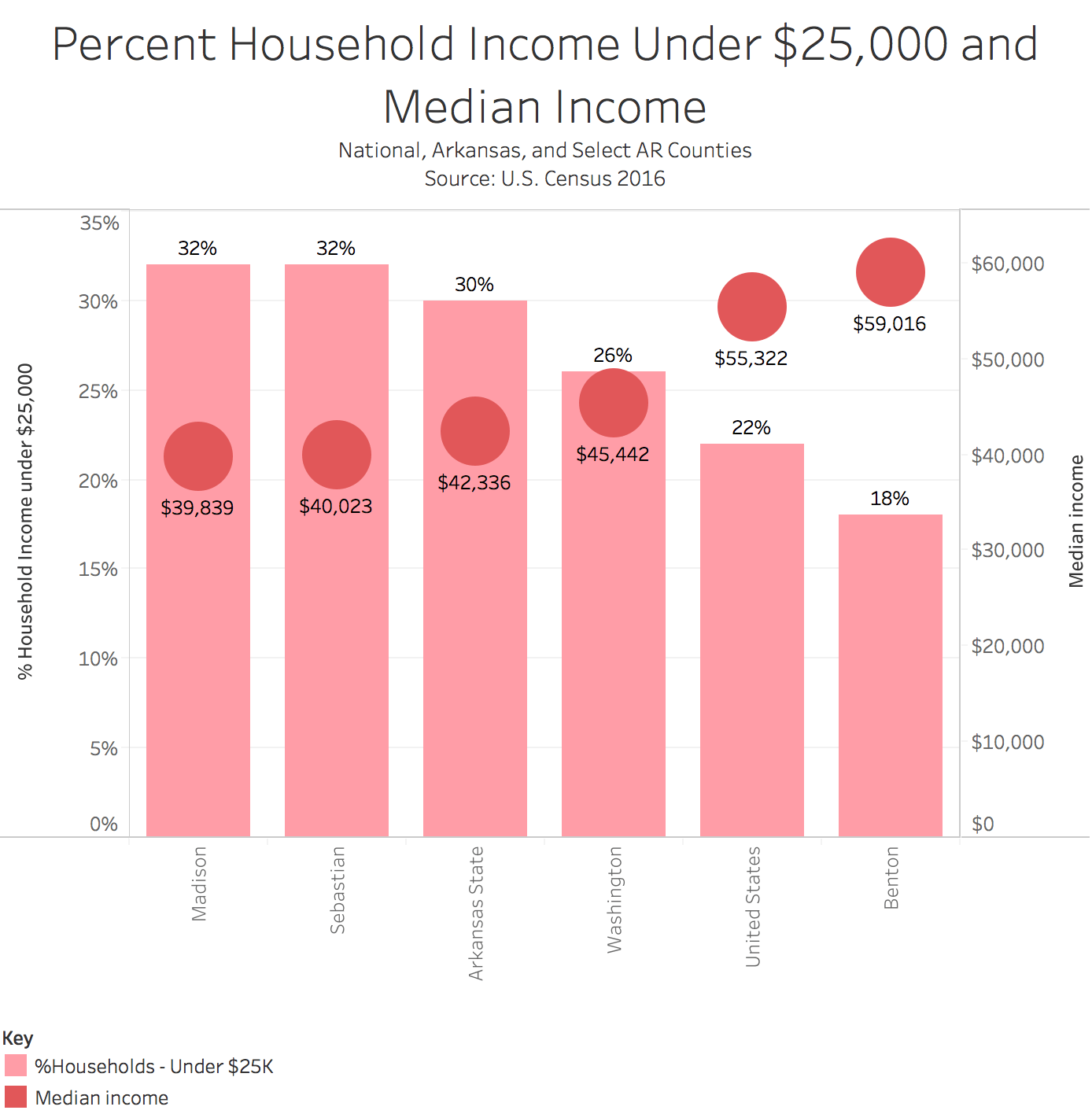
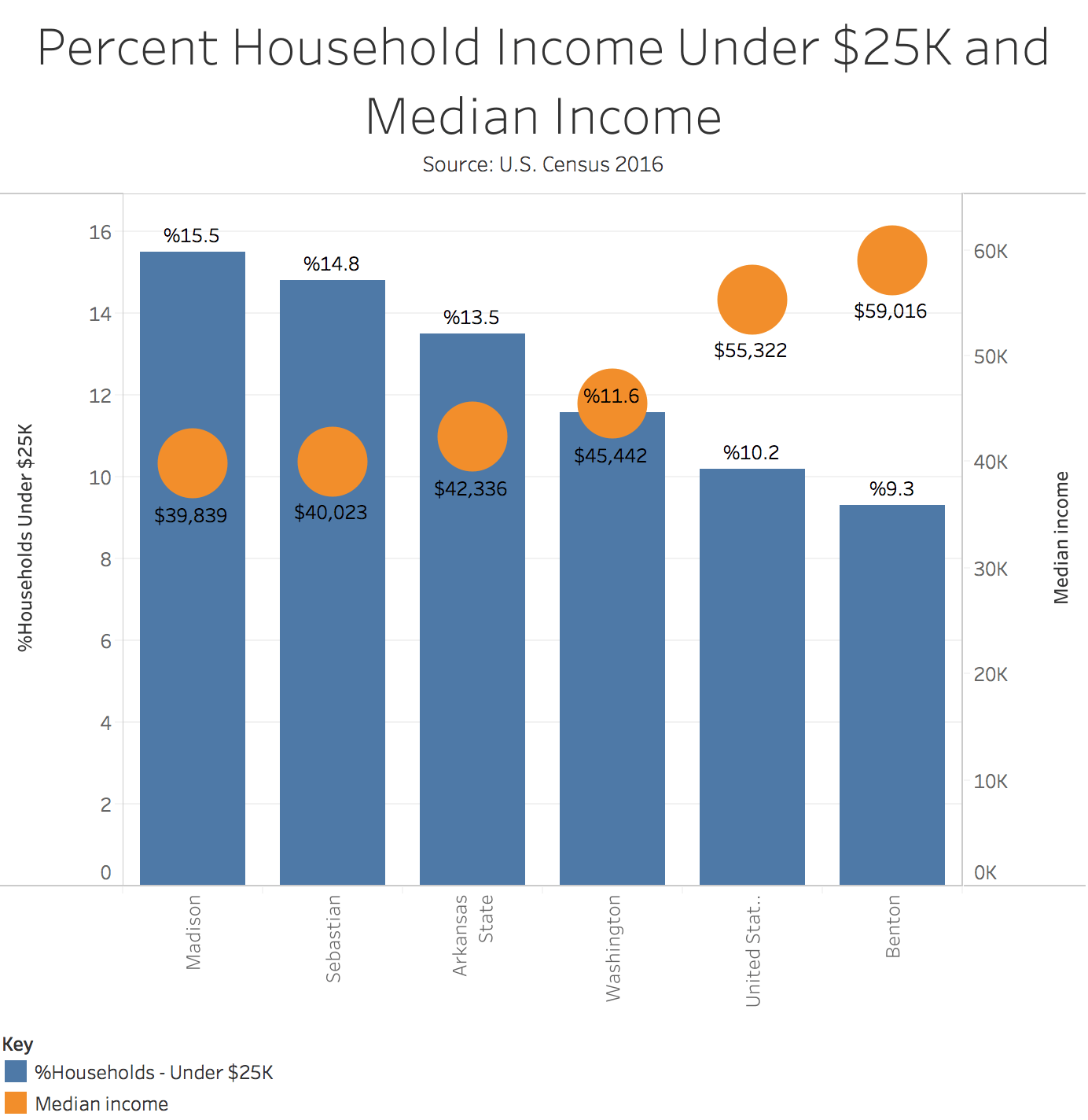
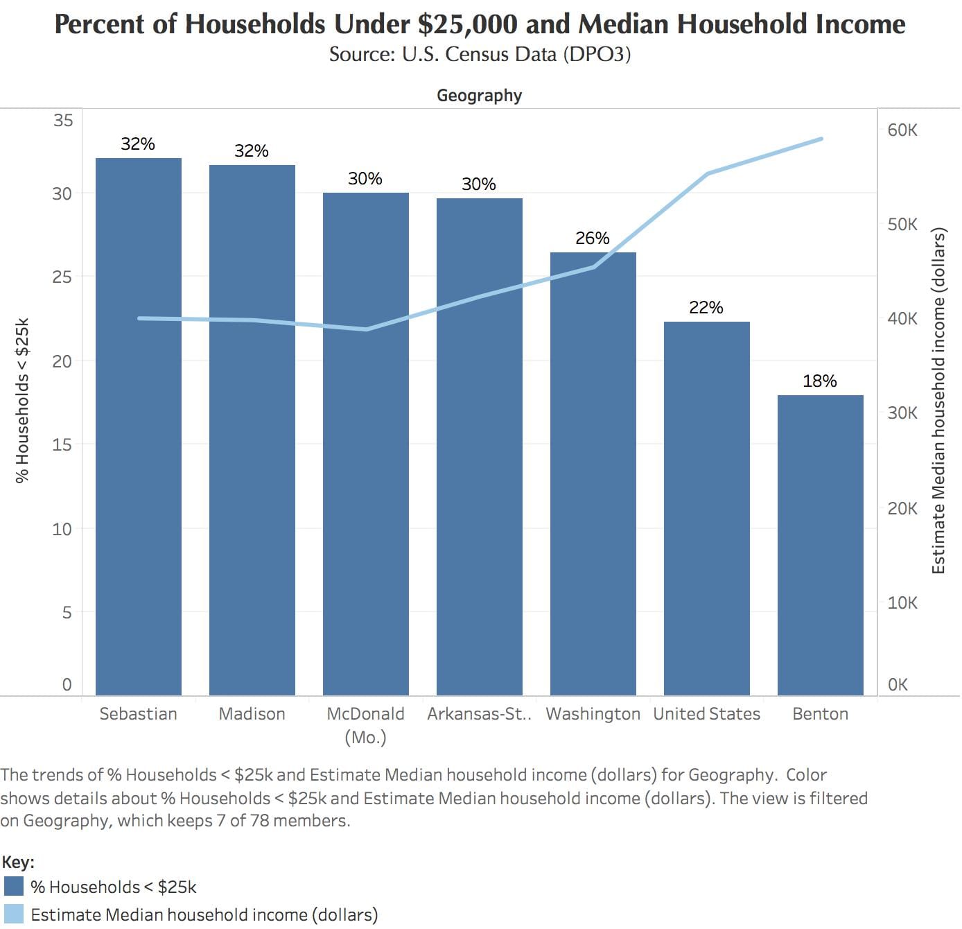
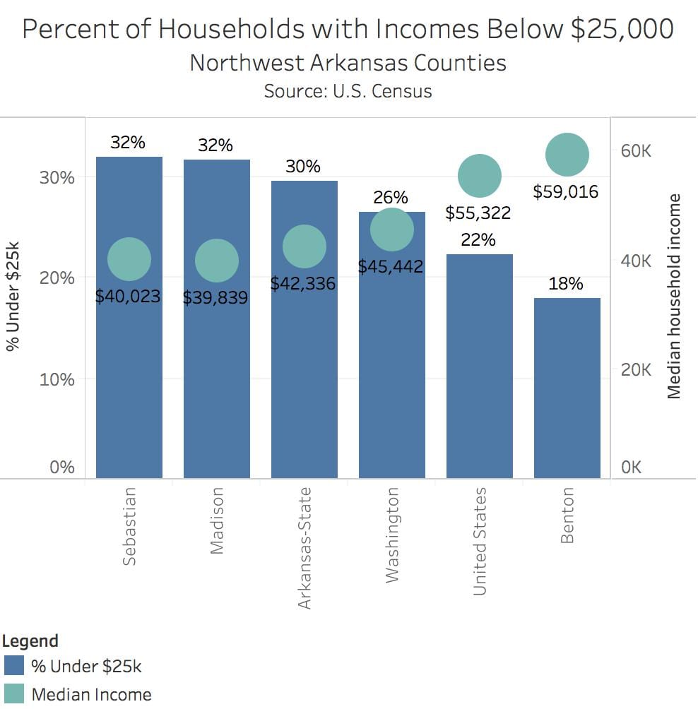
In Northwest Arkansas, there are discrepancies between the percent of households ( that are under the poverty line, and the Median household income. The counties that have the most households under the poverty line, also have the lowest median household income. Thirty–two percent of households in Sebastian County are under the poverty line, an income of $25,000 per year,, and the median household income is around $40,000 per year. This trend remains interesting and true throughout the counties, states, and the United States shown. Benton County, the home of the Wal-Mart Inc. has the lowest amount of households under the poverty line, and has the highest median household income at $60,000 a year.
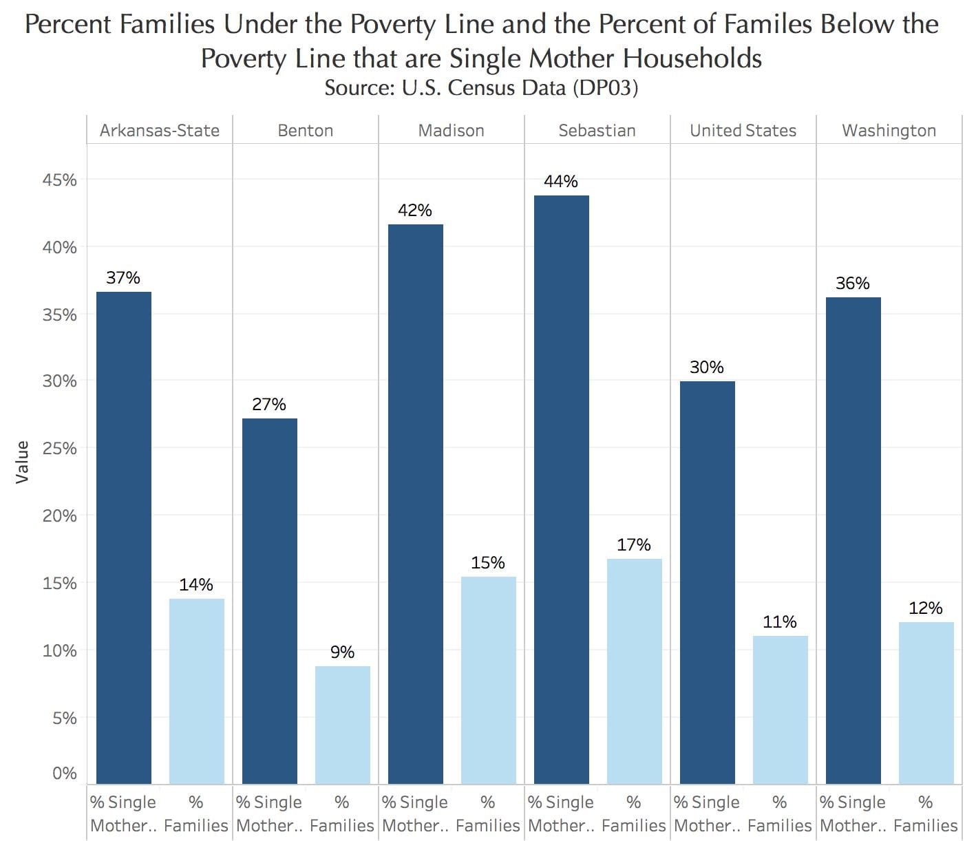
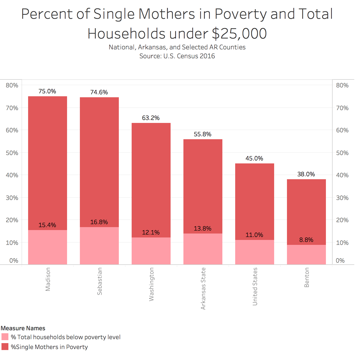
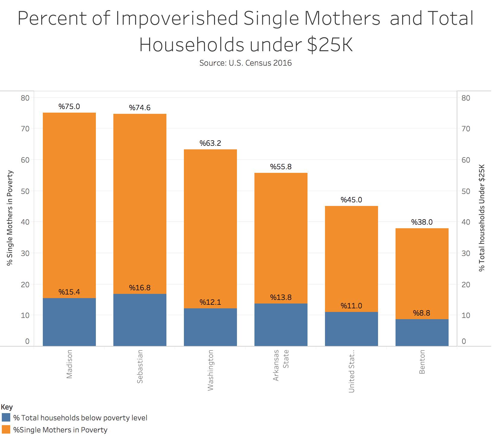
The next image explains the relationship between the percentage of families in poverty, and the percentage of those that are run by a single mother. One of the most shocking examples here is that of Sebastian County. It has the highest number of households below the poverty line, and the highest percentage of single mother households under the poverty line. Additionally, from this data, the United States has an alarming 30% of households under the poverty line being run by single mothers.
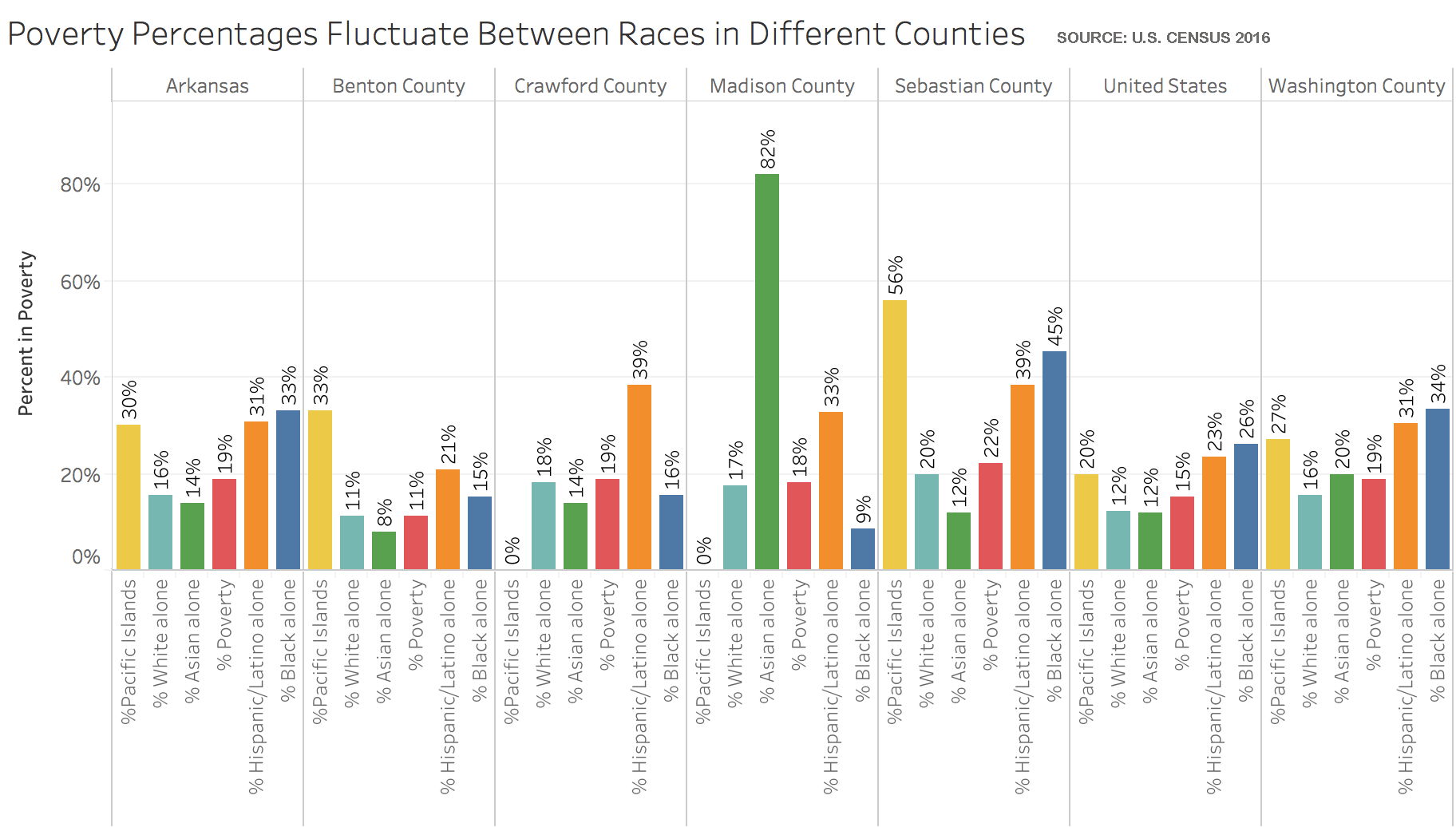
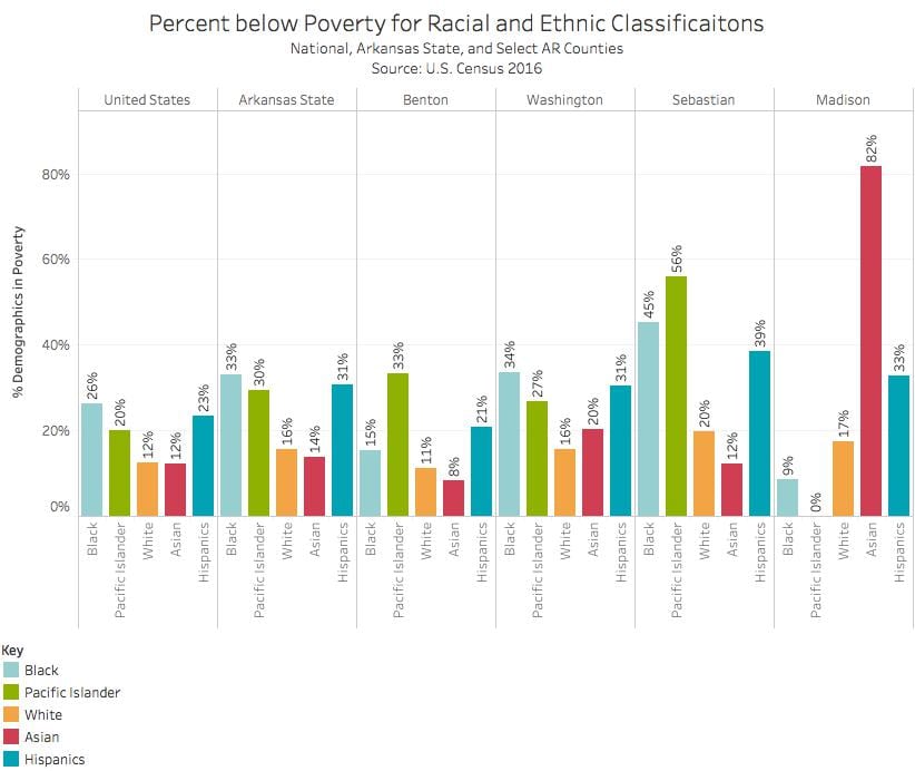
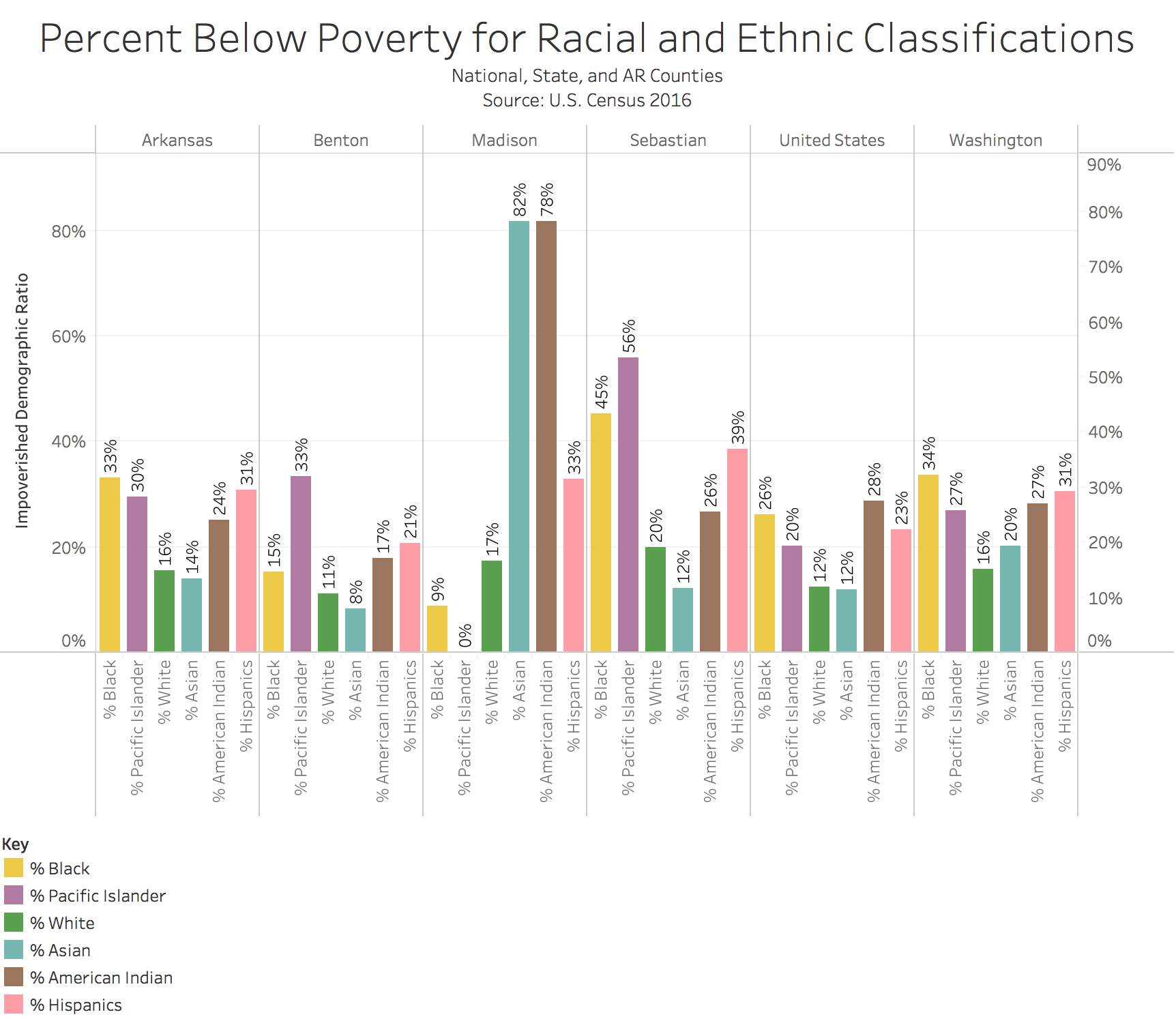
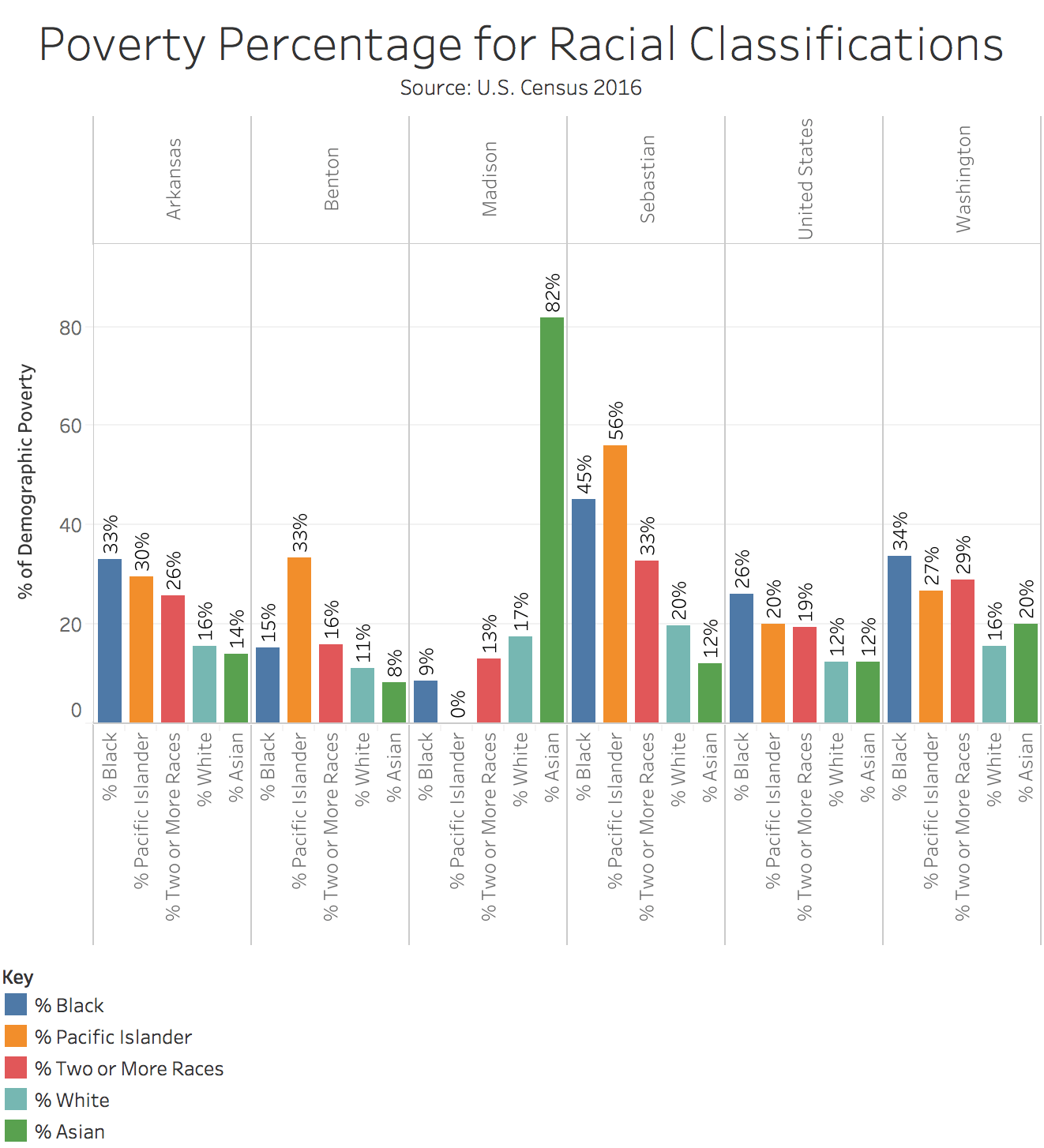
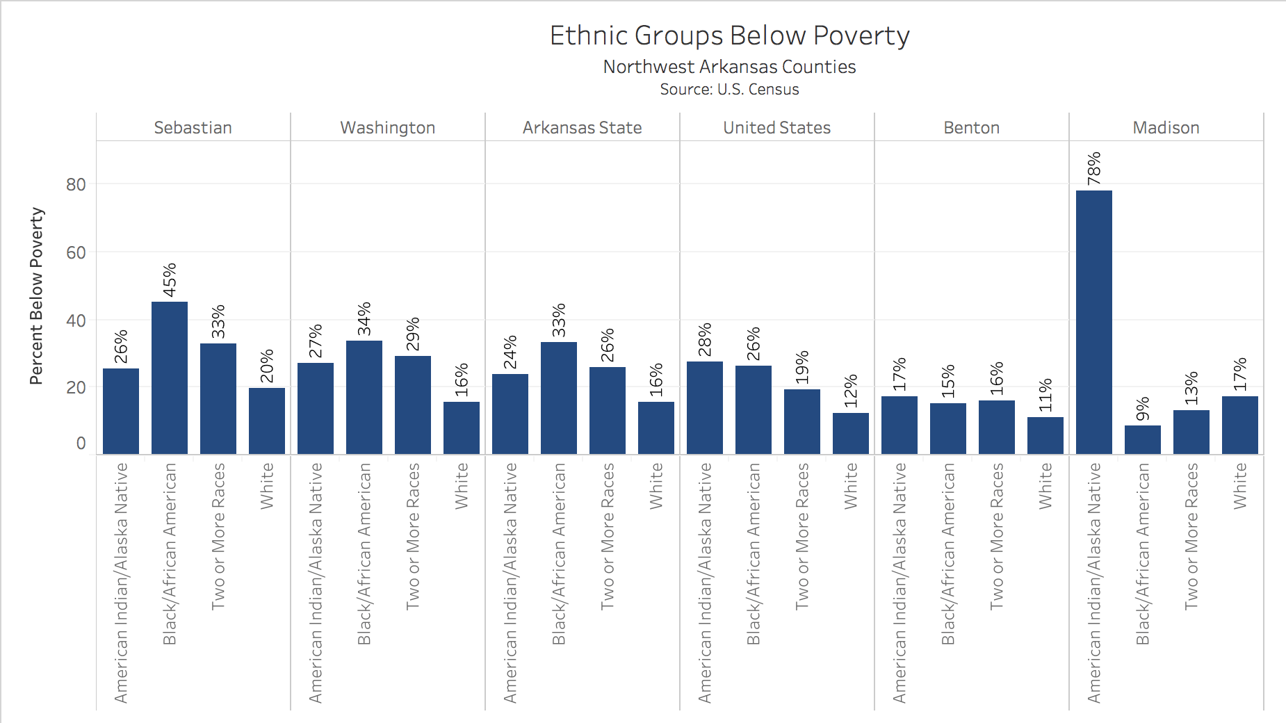
The following image demonstrates the most interesting discrepancies. It shows the distribution of different racial categories that are under the poverty line. The most common groups with the highest poverty rates are African Americans and Pacific Islanders. However, whites are always among the lowest below the poverty line in almost every county, except Benton County.

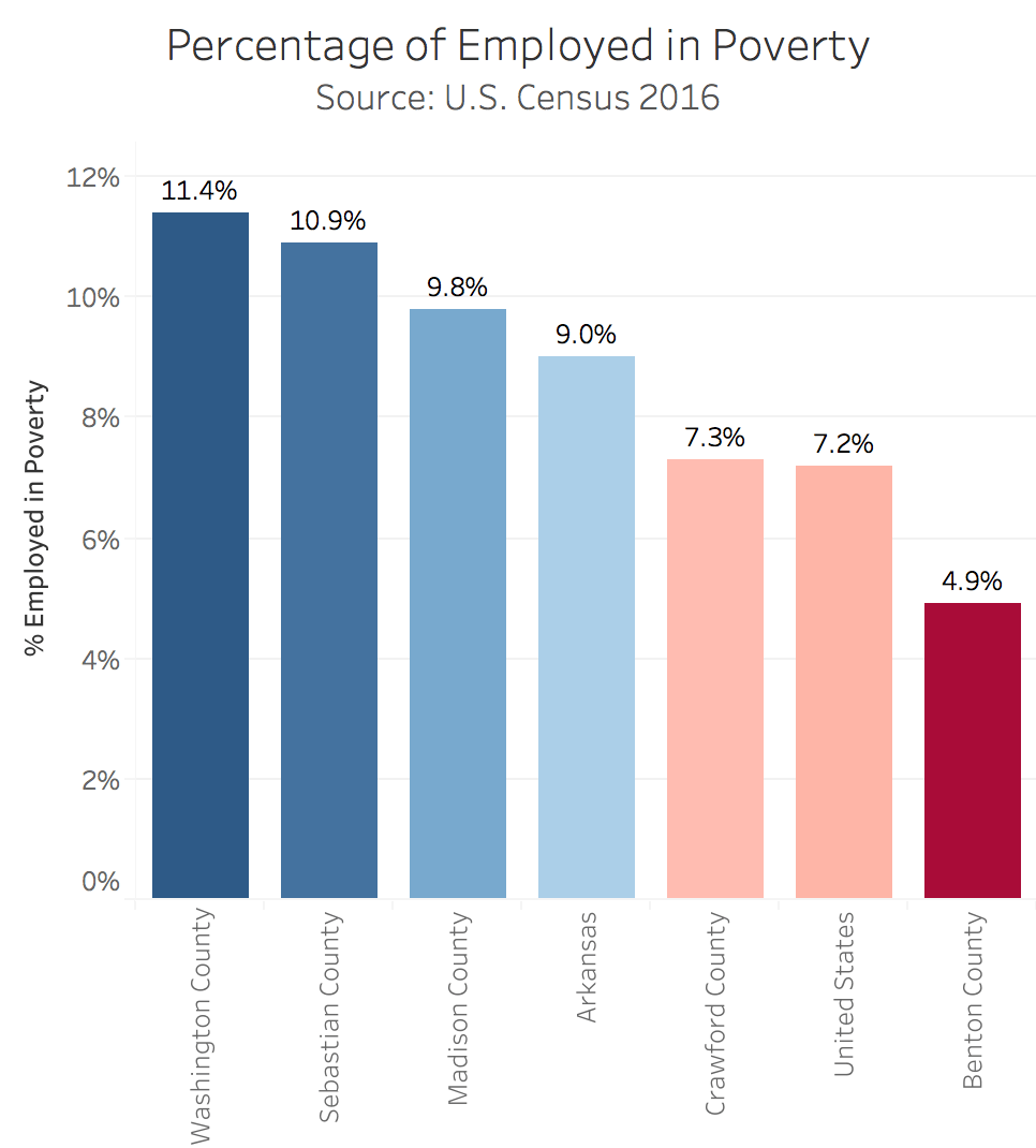
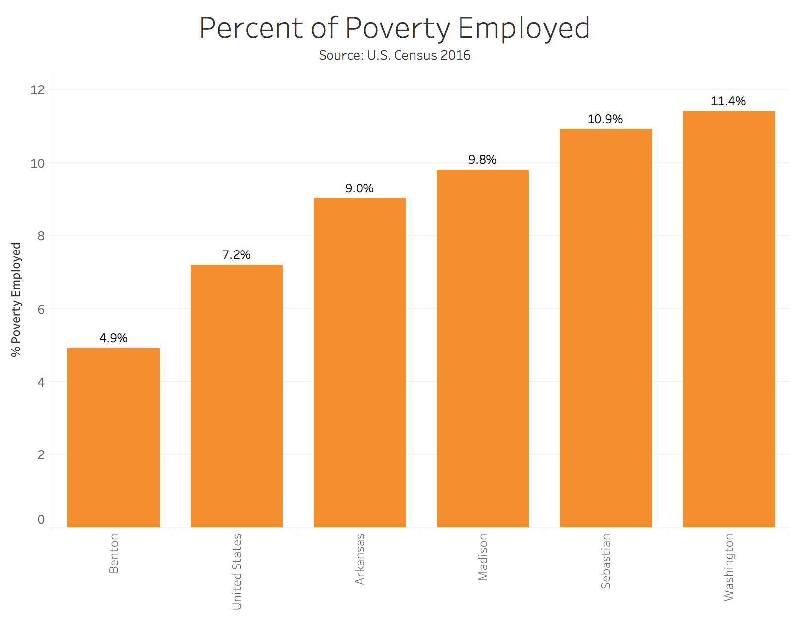
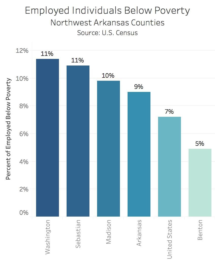
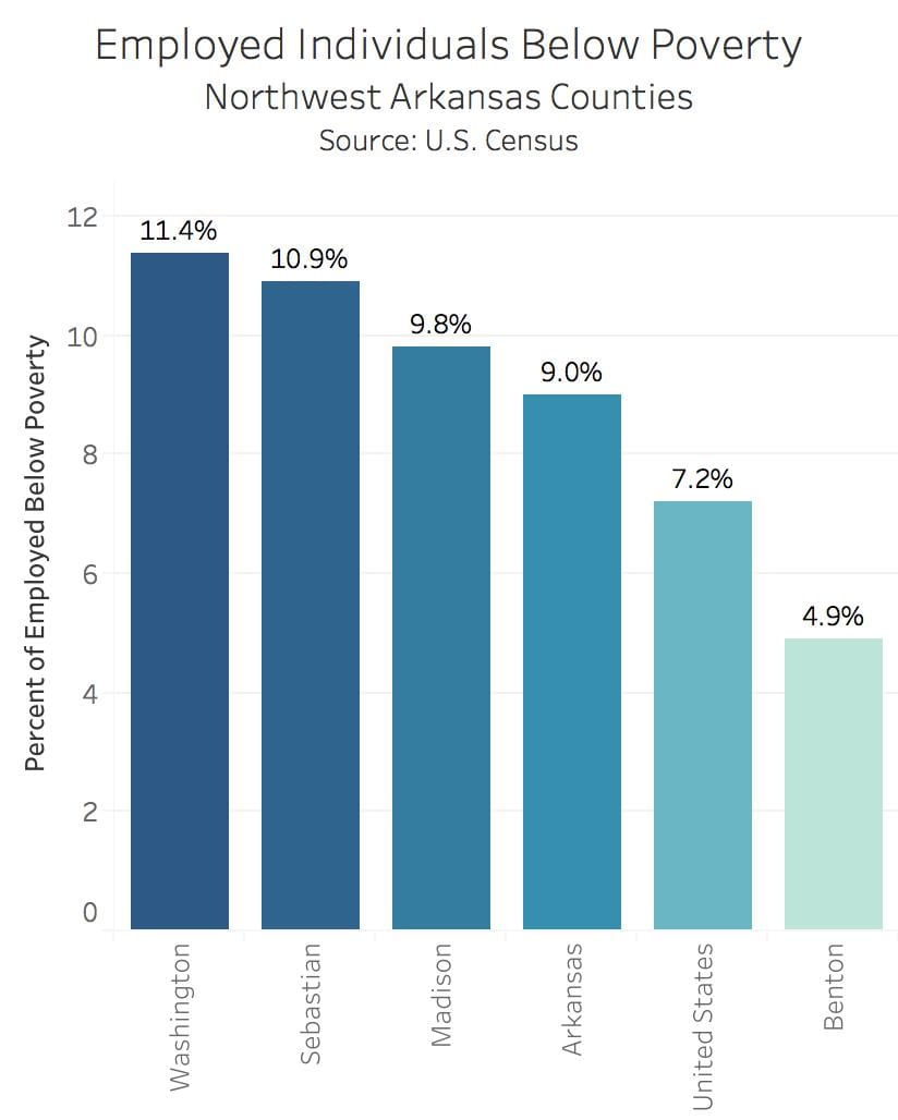
The image above shows the percentage of people in each county that are in poverty and employed. The county with the highest percentage is Washington County. However, the fact that there are people who are both employed and in poverty is consistently astonishing.

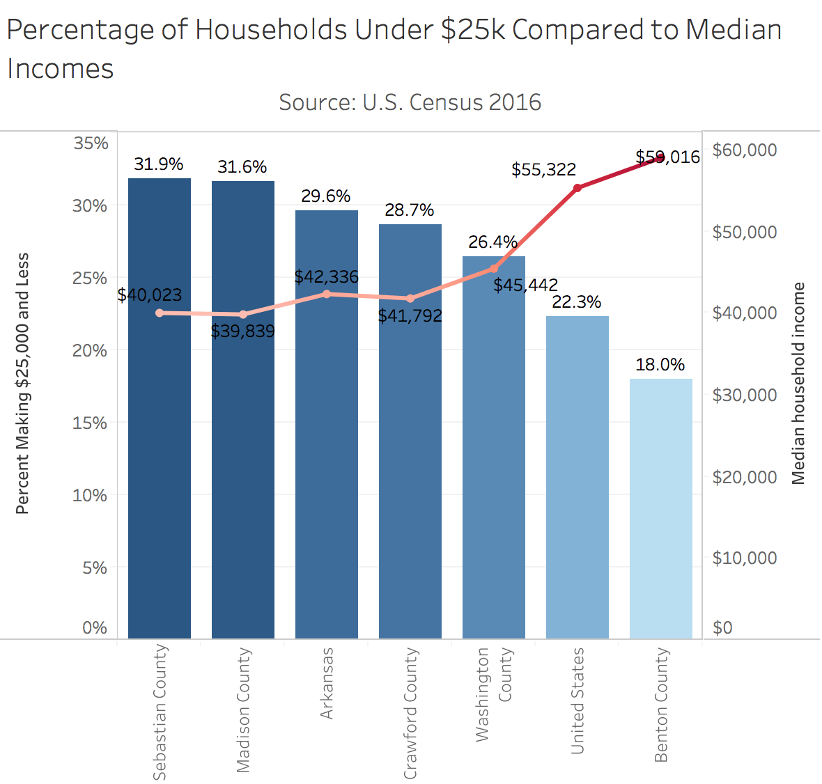
The images above represent the many distinctions of poverty in the Northwest Arkansas corridor, Arkansas as a state, and the country. They allow a clearer view at the groups that are most effected by poverty, as well as provide different types of measures to take to lower these percentages in these areas.
2-14 REVISED BLOGPOST – Andrew Epperson
Jenny Ridyard, 51, is a client services specialist at 7Hills Homeless Center in Fayetteville, Arkansas.
Before she spent her days helping the homeless population in Northwest Arkansas, she was homeless for seven months in the city. She lived in the woods with her husband, and her only true possessions were a tent and the clothes on her back.
Now, she lives on a base salary from 7Hills, and her husband earns disability money. Those two income paths combined with saving have allowed her to stake a claim in the middle class, but she was formerly at the lowest level of poverty.
“When I first moved into my apartment after getting hired, it was such a weird feeling,” Ridyard said. “I didn’t feel comfortable, because it seemed like it could all go away again.”
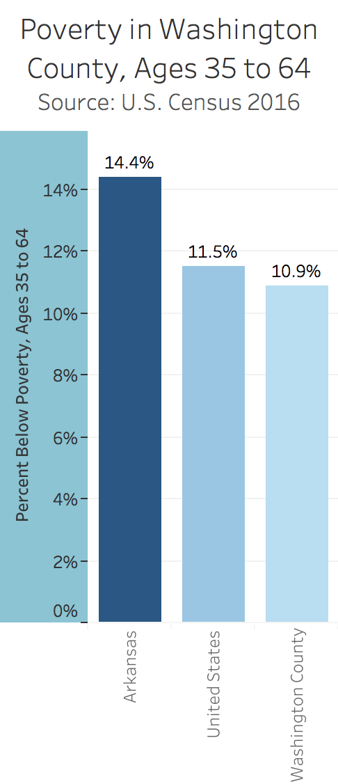
The percentage of impoverished workers in Washington County is noticeably higher than that in other Arkansas counties, according to data collected from the U.S. Census. Before Ridyard’s financial situation improved, she and her husband lived as one of the 11.4 percent that live in Washington County and work in poverty.
“We have Walmart, Tyson, J.B. Hunt,” Ridyard said. “There’s no reason why we don’t have the resources to help (homeless people).”
While poverty encompasses more than just the homeless population, the two can be comparable in the poverty conversation.
Washington County’s median household income is $45,442, according to the U.S. Census. That’s slightly more than the national average, but it’s still less than what the common Arkansan might think considering the area is seen as somewhat of an economic hub. As the median income increases, the percentage of people living in poverty decreases, according to the same statistics.
For a time, Ridyard was among the 10.9 percent of impoverished 35 to 64 year olds living in Washington County.
In Washington County, whites make up the fewest percentage of people in poverty. The black population makes up the most.
Ridyard does not have children, but across the board, the number of single mothers in poverty far exceeds that of the average person.

“I still feel like I can relate to them,” Ridyard said. “I don’t want for anything. I need what I need, but I don’t want. I know what it’s like to have nothing.”
The number of impoverished in Northwest Arkansas is higher than the national average, and the statistics back that up. Ridyard is no longer a part of that group, but she lived in an extreme form of poverty for an extended period of time.
Mary Kerr Winters – Class 5
Class 5: Feb 15, 2018
Agenda
–Principles of Data Visualization
–Occupational Employment Data
–Mapping #1: Build a Map in Google Fusion Tables
–Tableau and calculations. Reference Line in Tableau
–Audio recording and editing skills.
Principles of Data Visualization
How to Represent Your Data
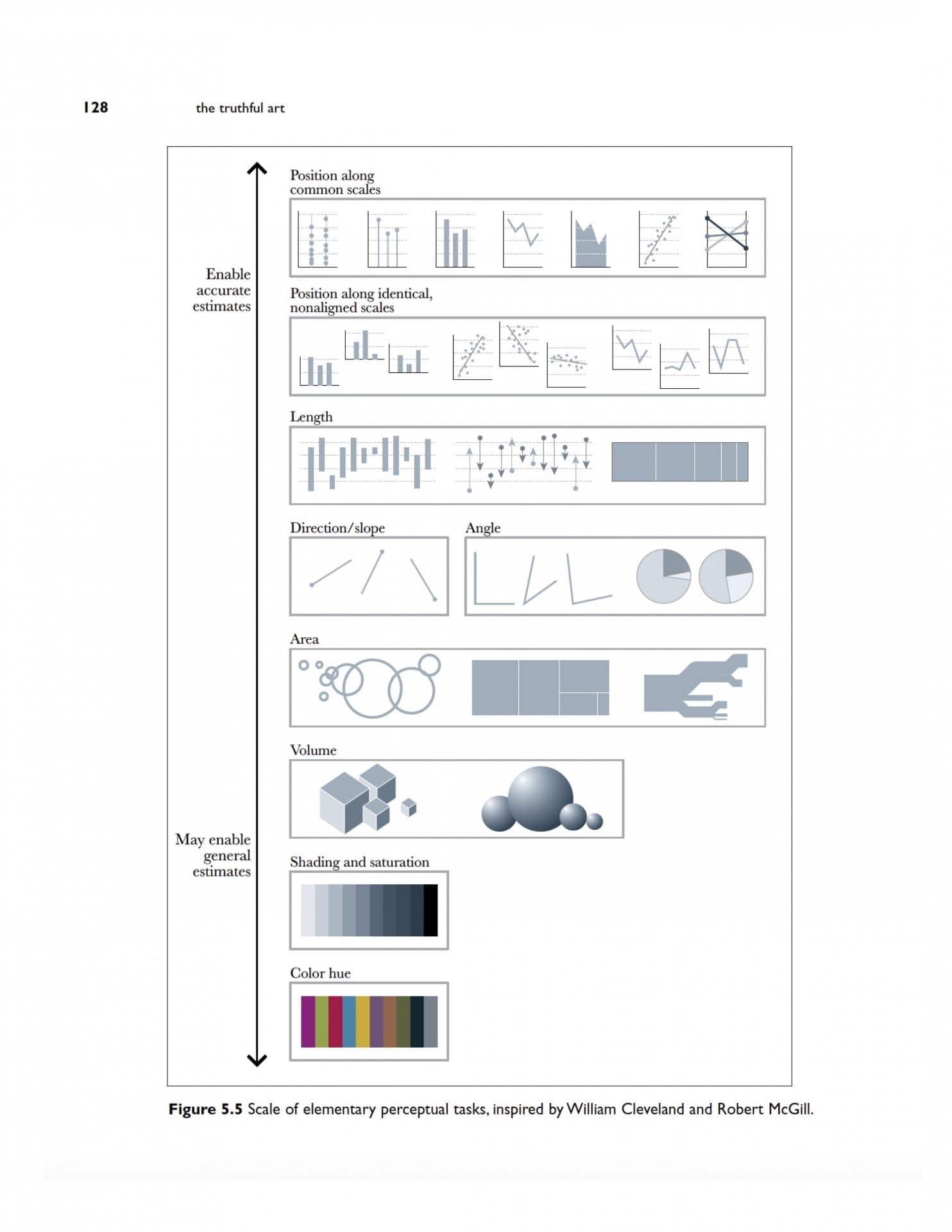
Cleveland McGill Scale
Dataviz Catalog
FT Visual Vocabulary
Build a Map in Google Fusion Tables
Download FBI Data and Map Crime Rates
Fusion Table
https://www.google.com/fusiontables/DataSource?docid=1xaT29A1j-Mr3u9X70X9CB6mrN_2WjzAxRFiiSmTO
https://www.google.com/fusiontables/DataSource?docid=1IHXqRKZiXStuRpelBDpPGbYw7sVTG8oXwMnHGsCN
Occupational Employment Data
Arkansas
https://www.bls.gov/oes/current/oes_ar.htm
NW Arkansas
https://www.bls.gov/oes/current/oes_22220.htm
- Identify jobs paying $9.50 an hour or less.
Gender and racial diversity in newsrooms. Note the animation
Class Occupational Employment Data
Arkansas
https://www.bls.gov/oes/current/oes_ar.htm
NW Arkansas
https://www.bls.gov/oes/current/oes_22220.htm
- Identify jobs paying $9.50 an hour or less.
- Sort by the largest number employed in this category
Compare to
- Identify jobs paying $9.50 an hour or less.
- Sort by the largest number employed in this category
- Compare to state.
Create a Reference Line for Poverty
Step 1 – Build the View
- Drag % Female Households – Children 5 Years to the Rows shelf.
- Drag Geography to the Columns shelf.
Step 2 – Create Parameters
- Right-click in the Data pane and then select Create Parameter.
- Name the parameter “Arkansas Average”.
- Under Data Type select Integer.
- Under Current Value, set to 55.8
- Under Allowable values select All.
- Click OK.
Step 3: Create the calculated field
- Select Analysis > Create Calculated Field.
- Name the calculated field “Reference Line”.
- In the formula field, enter the following formula:
- IF[% Female Households – Children 5 years younger]=[Arkansas Average] THEN [Arkansas Average] END
- Click OK.
Step 4 – Use the calculated field as a Parameter Control
- Drag the “Reference Line “calculated field to Details. This is the box below Color in the Marks Card
- Click the arrow to change the measure from SUM to Minimum.
- In the view, right-click on the Y axis and select Add Reference Line.
- In the Value drop down menu, select Minimum(Reference Line).
- In the Label drop-down menu, select Value.
- Click OK.
Homework
Reading Below on Data Diaries
Albert Cairo, The Truthful Art, Ch. 3 Chapter3TheTruthfulArt-2nw36qt
Cohen “Numbers in the Newsroom” p. 50-58. Averaging Averages. Weighted Averages. Standard Deviation; ch. 3,Working With Graphics.
Data Diary Examples
2) Christian McDonald
Oh, do I have feelings about this one…
I keep a data diary for myself that has everything from notes about public information requests, notes about where I got data, descriptions of what I did, sql queries and all kinds of things. I sometimes also make a data report that is really RESULTS of what I learned, as opposed to how I got there in the data diary. The data report is more for other reporters, editors and maybe sources, but the diary is for me, so less formal.
These days I’m trying to script more of my work using Jupyter Notebooks, which then tends to be a mix of the two. It has info about where the data came from and the code that made the result. Sometimes it is written for future me, sometimes for the public. Generally, I’ll still keep a personal data diary just for my future self, ‘cause I can’t remember what I did yesterday much less last week.
Data diaries I tend to write in markdown files on my machine so code doesn’t get wigged with curly-quote translations. Data reports are typically Google Docs or Jupyter Notebooks on Github.
Aubry Tucker: Assignment One_with Revisions
In Arkansas and in the United States there is a relationship between the median income of the area, and the percentage of families living on less than $25,000 a year. Based on data gathered from the U.S. Census you can see the higher the median income the less likely that population will have a household income of less than $25,000.
If you look at the graph below you can easily spot the correlation between the median income and the percentage of that population living off an annual income of less than $25,000. In turn you can assume that higher paid areas have less people in poverty, and therefore less consequences that come tied to poverty.
The percentage of single mothers in poverty is much higher than the percentage of the total population. In some counties in Arkansas three out of four women are raising their children in poverty. The data analyzed in this graph is also single moms with young children. This is another aspect worth considering in the time, money, patience it takes to raise children.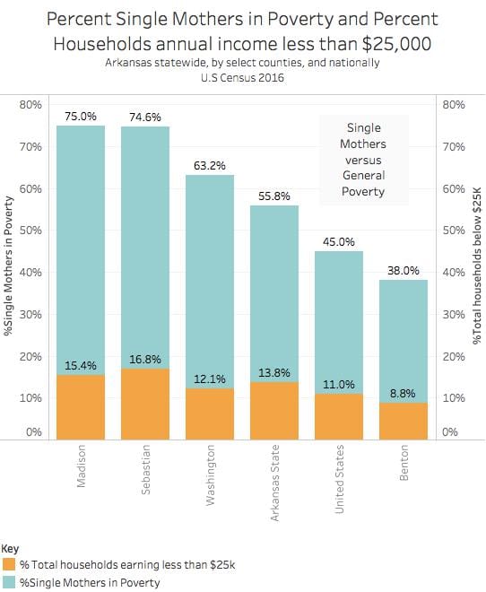
The graph representing the percentages different demographics living in poverty is illustrated in a side by side manner for comparison. Madison county is perhaps the most surprising of the data. It shows that the Asian population is living at a staggering 82% poverty rate. This sounds really extreme especially since it doesn’t match the trends of the other counties, statewide in Arkansas, or even the national average. What needs to be considered here is the size of the Asian community present in Madison County. If it’s small enough then a majority in poverty portrays a high ratio of impoverished asian households
The final graph shows the percent of people living in poverty despite having a job. The highest percentage of impoverished people with jobs is in Washington county. The lowest percentage of lowest impoverished people with jobs is Benton county. Percentages are really easy to overlook, but 11.4 percent means one out of every 10 people are challenged to make a living, feed their family, themselves, not to mention basic care and insurance.

Mary Kerr Winters – Assignment #1: Census Data
Most recent economic statistics from U.S. Census 2016 show how race, gender, poverty, and income all play a large role in the general lives of individuals in Arkansas and the United States.
When comparing the percentage of households under $25,000 to the median income, Benton County, Arkansas has the lowest percentage of households making $25,000 and less at 9.8 percent, which means it also has the highest median income of about $59,000. This number is higher than the average median income most Americans make according to U.S. Census. As long as more money is being made, the percentage of lower wage households will stay low.
There is a significantly higher percent of single mothers in poverty than the total households that make under $25,000 in each selected county as well as the United States. In Madison County, Arkansas there is 15.4 percent of total households and 75 percent of single mothers in poverty. This drastic gap of nearly 60 percent causes skepticism in the reasoning behind why there are so many single, impoverished mothers in today’s economy.
After reviewing the single mothers in poverty, it is interesting to see the percentage of the individuals employed in poverty in these areas. In Washington County, 11.4 percent of impoverished individuals are working while only 5 percent are working in Benton County. Remembering that Benton County has the highest median income, these percentages show that the higher the median income, individuals are less likely to be living in the working poverty.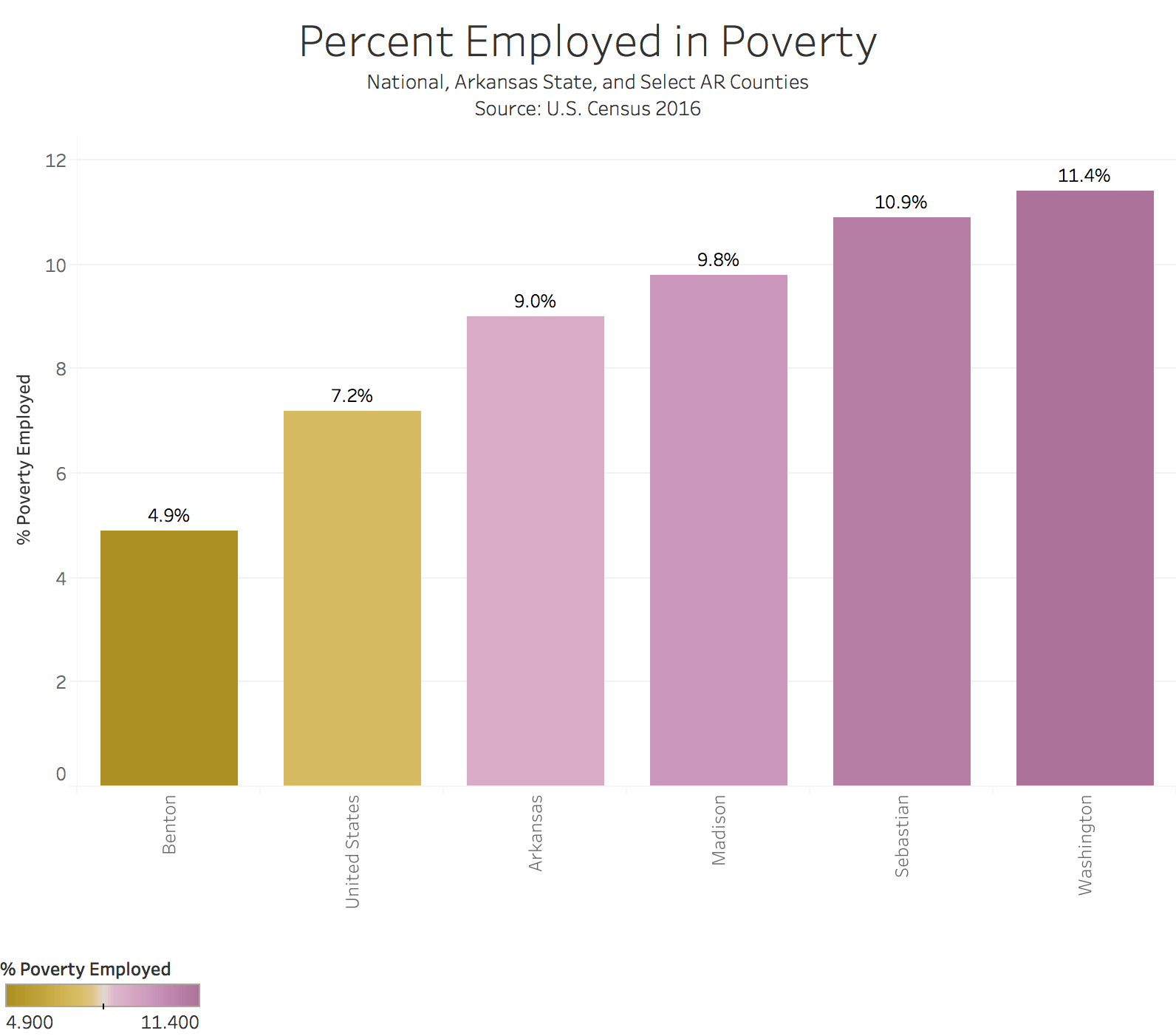
It is evident that race and ethnicity play a role in poverty percentages because race is everywhere and will always effect the economy. U.S. Census 2016 compared the percentages below poverty of Whites, Black or African Americans, Asians, Pacific Islanders and Hispanics. In Madison County, Asians exceed the other classifications by over 50 percent. Everywhere else in the comparisons is generally the same with Hispanics and African Americans competing for the highest rate of impoverished people.
These economic statistics in Arkansas and United States need to be taken into deep consideration when discussing difficult situations dealing with poverty and race.
PovertyData_2_12-11qbsrv Race Poverty2-14-2evj0zq
Assignment #1 -Ann Claire Johnson
Assignment #1 Katie Serrano- rsw update 2-26
When Hunter Smith, 22, and his family moved to Arkansas from Iowa, his mother was a nurse, his father was a doctor and he was enrolling in college.
That was 10 years ago.
Now, Smith and his mother are working at Taco Bell, the only place he can work because he drunkenly lost his ID over a month ago, barely making ends meet while his father looks for a job.
A quarter of Washington Counties population is in poverty, according to data from the U.S. Census. Out of that number, 11 percent are employed and 19 percent are between the ages of 18 and 34.

“I used to consider our family middle class,” Smith said. “But things happen and my parents got laid off. I still live with them and am saving up money so I can get a job and start going to school again.”
Smith’s family is one out of the 30 percent of households in Arkansas below poverty, compared to the national average of households below poverty at 22 percent.
White working-poor families aren’t the only demographic struggling in Northwest Arkansas. African Americans make up the largest percent of a specific ethnic group in Washington County, and also make up the largest percent state-wide. Looking at a national average, 26 percent of the African American population is in poverty, according to the U.S. Census.
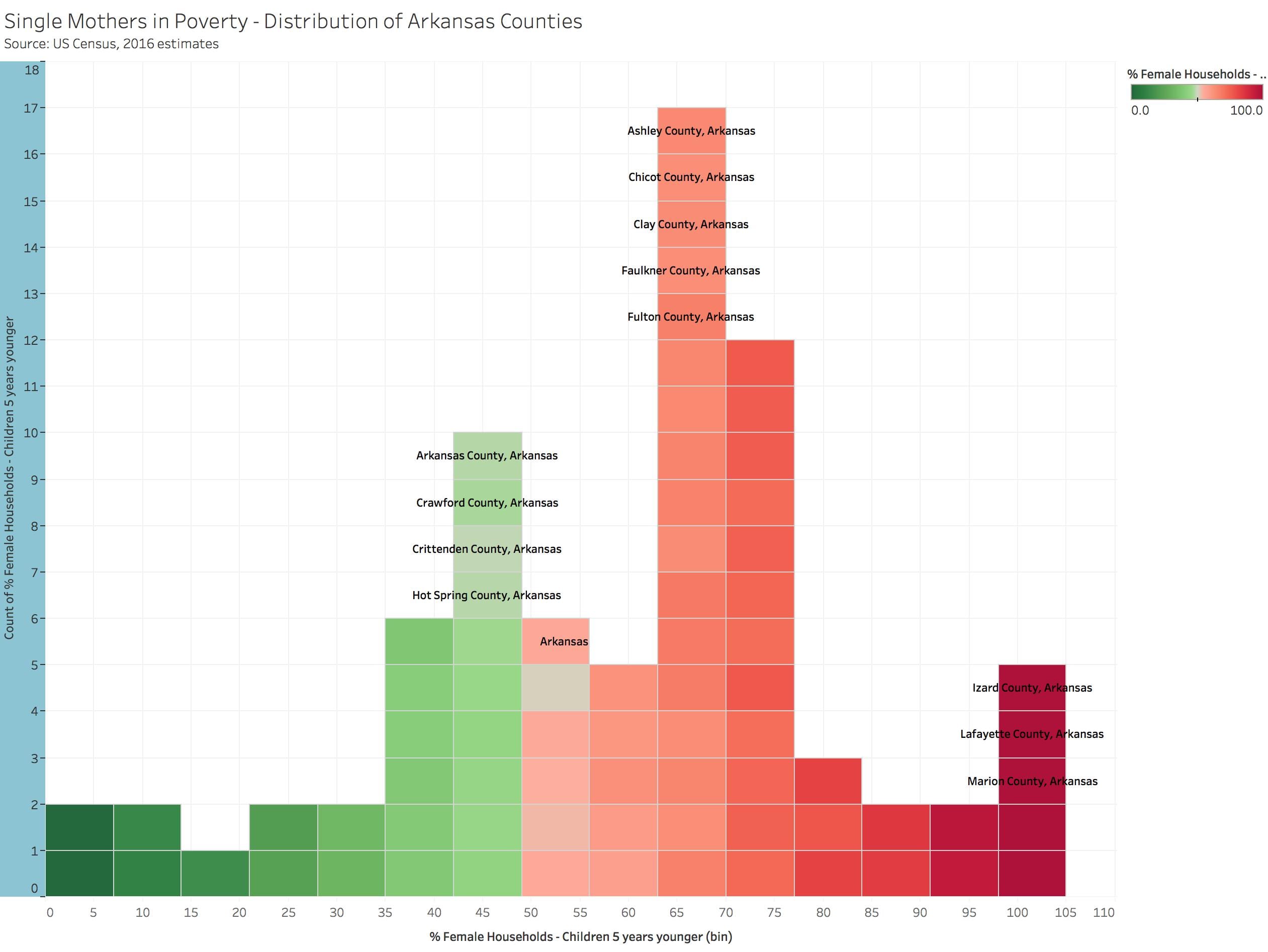
Another poverty-stricken group in Arkansas is single-mothers. In Izard, Lafayette, Marion, Scott and Woodruff County, 100 percent of the single-mother households are in poverty, according to the U.S. Census. Sixty-three percent of single-mother households in Washington County are in poverty, compared to the only 12 percent of households in poverty. On a national scale, 11 percent of households are in poverty compared to the 45 percent of single-mother households.
Varying demographics in Northwest Arkansas, as well as state-wide, are suffering trying to make ends meet. Employed individuals and families, like Smith, are still sitting significantly below the national poverty line.
Excel Spreadsheet:
Class 4: Feb 8, 2018
Agenda
Discuss interview progress
Review the charts from homework
Task #3: Download Census Data with Demographic Information.
Discuss ReadingAssignment #1
Audio gear:
Interviewing
Histogram and Reference Line
Examine Occupations and Salaries in OES Database
Review the charts from homework
Data: Task #2, Poverty Charts
–Statewide trends for Arkansas.
–Northwest Arkansas counties
–Statewide trends for female households
–Northwest Arkansas counties female households.
Assignment #1
Due 11:59 p.m. Wednesday, Feb 14. Post on WordPress
Assignment #1: Census Data – Excel-Tableau.
Graduate Version of Assignment #1
Rubric
Dual Axis
Compare single mothers in poverty to total poverty rates
Rows % Female Households and %Poverty All families
Click on Green Pill Sum (% Poverty All Families) Dual Axis
Unified Axis.
Left click on legend, synchronise axis
Marks Card – turn all poverty to bars.
Label individual cards
Tableau Dual Axis chart
http://kb.tableau.com/articles/howto/dual-axis-bar-chart-multiple-measures
Build the spreadsheet for question #1
Data is: ACS_16_5YR_DP03 DP03 SELECTED ECONOMIC CHARACTERISTICS 2012-2016 American Community Survey 5-Year Estimates
Copy main data sheet and call copy wages below $25k
Delete all data fields except headers and these columns
HC01_VC74 Estimate; INCOME AND BENEFITS (IN 2016 INFLATION-ADJUSTED DOLLARS) – Total households
HC01_VC75 Estimate; INCOME AND BENEFITS (IN 2016 INFLATION-ADJUSTED DOLLARS) – Total households – Less than $10,000 HC03_VC75 Percent; INCOME AND BENEFITS (IN 2016 INFLATION-ADJUSTED DOLLARS) – Total households – Less than $10,000 HC01_VC76 Estimate; INCOME AND BENEFITS (IN 2016 INFLATION-ADJUSTED DOLLARS) – Total households – $10,000 to $14,999 HC03_VC76 Percent; INCOME AND BENEFITS (IN 2016 INFLATION-ADJUSTED DOLLARS) – Total households – $10,000 to $14,999 HC01_VC77 Estimate; INCOME AND BENEFITS (IN 2016 INFLATION-ADJUSTED DOLLARS) – Total households – $15,000 to $24,999 HC03_VC77 Percent; INCOME AND BENEFITS (IN 2016 INFLATION-ADJUSTED DOLLARS) – Total households – $15,000 to $24,999 HC01_VC85 Estimate; INCOME AND BENEFITS (IN 2016 INFLATION-ADJUSTED DOLLARS) – Total households – Median household income (dollars)
Standard Data Cleaning
–Rotate header rows, wrap text.
Shrink verbiage from Estimate; INCOME AND BENEFITS (IN 2016 INFLATION-ADJUSTED DOLLARS) – Total households to “Total households”
Total households %Total households Total households – >$10k %Total households – >$10k Total households – $10kto $14,999 %Total households – $10kto $14,999 Total households – $15,000 to $24,999 %Total households – $15,000 to $24,999 Median household income$
–Specify Arkansas-state
Then find/replace to eliminate “County, Arkansas” from geography labels.
Create Total Under $25 column.
Add Total households – >$10k + Total households – $10k to $14,999 + Total households – $15,000 to $24,999
Create % Under $25k column (total Under $25k / total households)
Copy formulas down
Check math
When satisfied, copy and paste values
Census Demographic data
Household income data for counties and state and national. Gender and demographics of low-wage workers
American FactFinder
https://factfinder.census.gov/faces/nav/jsf/pages/index.xhtml
Advanced Search | Show Me All
Topics | People | Poverty | Poverty (added to Your Selections)
Geographies | County | Arkansas | All Counties Within Arkansas
Geographies | United States
Geographies | Arkansas
Select Table S1701, Poverty Status in the Past 12 Months
Modify Table
—Select top Filter
—Total and Percent Below Poverty Level
—Select second Filter
—Keep Estimate, do not check margin of Error
Download
—Use the Data
Download Again
—View the Data
—Excel spreadsheet
Questions about categories and definitions:
See “Table Notes” to far right on factfinder website after you’ve generated a table.
Read: “Poverty Status in the Past 12 Months”
“Poverty Status of Households”
Definitions. working Poor
–Poverty thresholds:
The actual poverty thresholds vary with the makeup of the family. In 2015, the weighted average poverty threshold for a family of four was $24,257; for a family of nine or more people, the threshold was $49,177; and for one person (see Unrelated individuals), it was $12,082. Poverty thresholds are updated each year to reflect changes in the Consumer Price Index for All Urban Consumers (CPI-U). Thresholds do not vary geographically. (For more information, see “Income and poverty in the United States: 2015.”)
https://www.bls.gov/opub/reports/working-poor/2015/home.htm#unrelatedindividual
Weighted Average Poverty
Thresholds in 2015 by Size of
Family
(Dollars)
One person 12,082
Two people 15,391
Three people 18,871
Four people 24,257
Five people 28,741
Six people 32,542
Seven people 36,998
Eight people 41,029
Nine people or more 49,177
Source: U.S. Census Bureau.
https://www.census.gov/content/dam/Census/library/publications/2016/demo/p60-256.pdf
Part 2 – Clean This Sucker
–Duplicate main data to a second tab
–Keep just the race/ethnicity categories and percent workers in poverty
–Clean headers – titles for Tableau
Find/Replace
Percent below poverty level; Estimate; RACE AND HISPANIC OR LATINO ORIGIN –
Replace with %
Background: Video on Factfinder
30:00 shows how to use the fact finder
https://www.census.gov/data/training-workshops/recorded-webinars/measuring-america.html
More on Data Cleaning Census spreadsheets
–Download the view and the data versions of large spreadsheets. One to guide you. the other to do the work.
–Merge / unmerge cells
–Find-Replace
— =CONCATENATE(B3, B4).
Review Reading
Meyer, “New Precision Journalism,” Ch. 1-2
Class Matters (Intro, Ch 1)
Meyer writes: “Precision journalism threatened the twin traditions of journalistic passivity and journalistic innocence.” What does he mean by that? What are the implications of this?
Material For Later….
Statistical terms
Statistical terms used in research studies_ A primer for media – Journalist’s Resource-125sc4a
Income and Poverty Background
DeNavas-Walt Income and Poverty in the United States- 2014 U.S. Census 2015-28iyb03
Adding a Cumulative Distribution to a Histogram
This class demonstration provides a detailed walk-through of how to add a cumulative distribution to a histogram in Tableau. Students are encouraged to follow along and/or take notes on the provided Student Handout. This topic uses the Global Superstore dataset.
- Build a histogram with % Female Households in Poverty
- Easiest method: click on% Female Households in Poverty and choose the histogram from Show Me
- Find out where this is happening: drag Geography to the pane. Now hover your mouse over the blocks and you will see the counties.
- Duplicate the CNT(Profit) pill on Rows by Ctrl+drag the pill next to itself on the Rows shelf
- This gives you a new marks card – now you can create 2 different types of mark for a single data field. On the new marks card “CNT(Profit)(2)”, change the mark type to a line
- Change the color as well, if desired
- Right click on the duplicated field on the Rows shelf and make it a dual axis
- Apply a Quick Table Calculation of Running Total to the duplicated field
- [[If students find this histogram to be uninteresting, add a filter on Profit to ignore outliers (maybe go from -500 to +500). Then right-click Profit(bin) dimension and Edit to make the bin size smaller, maybe 25.]]
Create a Reference Line for Poverty
Step 1 – Build the View
- Drag % Female Households – Children 5 Years to the Rows shelf.
- Drag Geography to the Columns shelf.
Step 2 – Create Parameters
- Right-click in the Data pane and then select Create Parameter.
- Name the parameter “Arkansas Average”.
- Under Data Type select Integer.
- Under Current Value, set to 55.8
- Under Allowable values select All.
- Click OK.
Step 3: Create the calculated field
- Select Analysis > Create Calculated Field.
- Name the calculated field “Reference Line”.
- In the formula field, enter the following formula:
- IF[% Female Households – Children 5 years younger]=[Arkansas Average] THEN [Arkansas Average] END
- Click OK.
Step 4 – Use the calculated field as a Parameter Control
- Drag the “Reference Line “calculated field to Details. This is the box below Color in the Marks Card
- Click the arrow to change the measure from SUM to Minimum.
- In the view, right-click on the Y axis and select Add Reference Line.
- In the Value drop down menu, select Minimum(Reference Line).
- In the Label drop-down menu, select Value.
- Click OK.
Visualize the income distribution in a histogram
% of Female Households – Children 5 Years and Younger.
–Drag to Columns
–Show me: Select Histogram
–Distribution of the poverty level.