


Research the Banks, Part 1
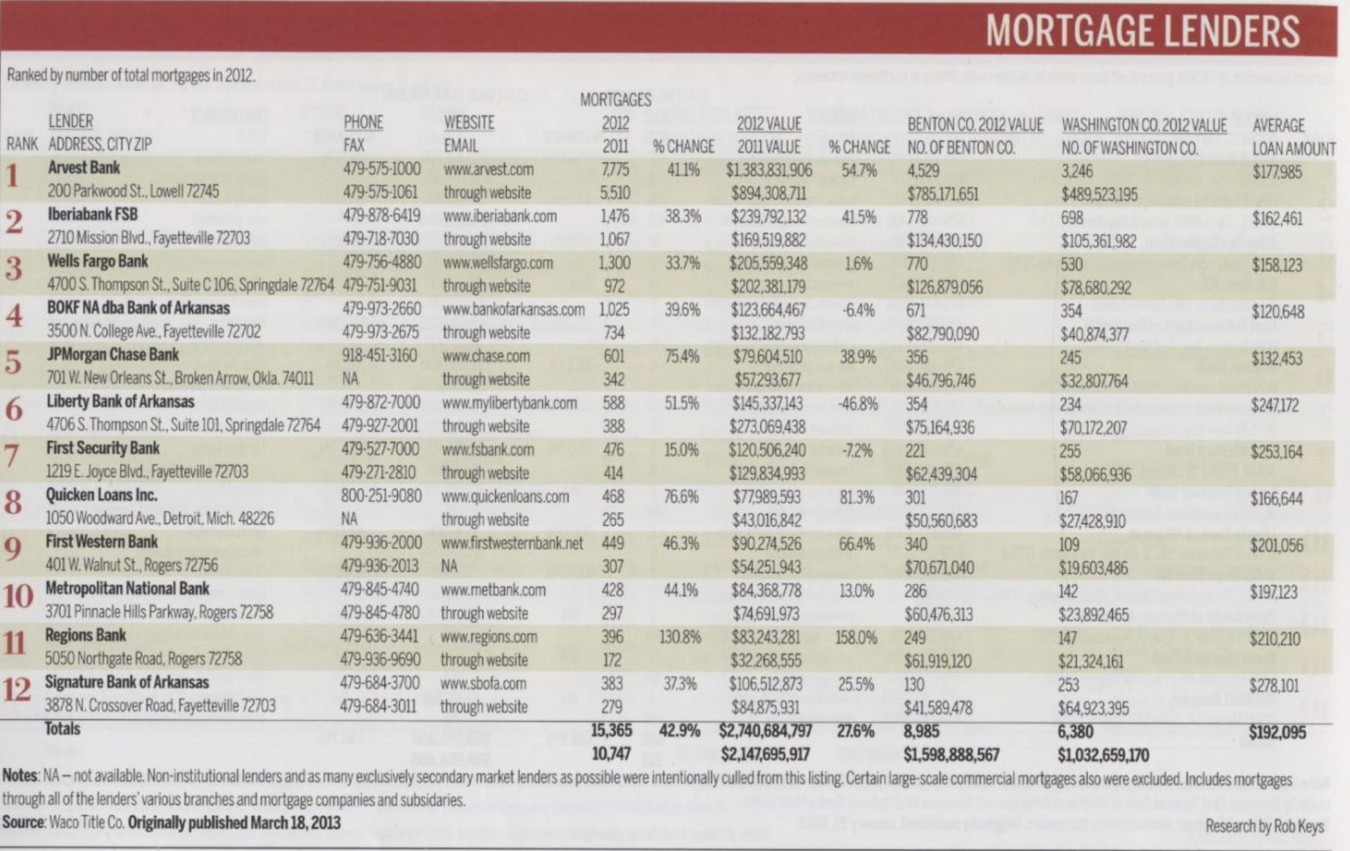
Build a Spreadsheet from the 2013 Book of Lists, Northwest Arkansas Business Journal.
Use these fields: Rank/Lender/ City /2012 Mortgages /2011 Mortgages /% Change Number /2012 Value /2011 Value /% Change Value
Create New Calculated Field Determine the Total Marketshare of Each Bank for 2012
Produce a Data Visualization in Tableau or Excel on
#1 the Number of Mortgages
#2 the Amount of the Loans
#3 The Overall Marketshare
Post these graphics in your blog post by 11:59 PM WEDNESDAY OCT 5
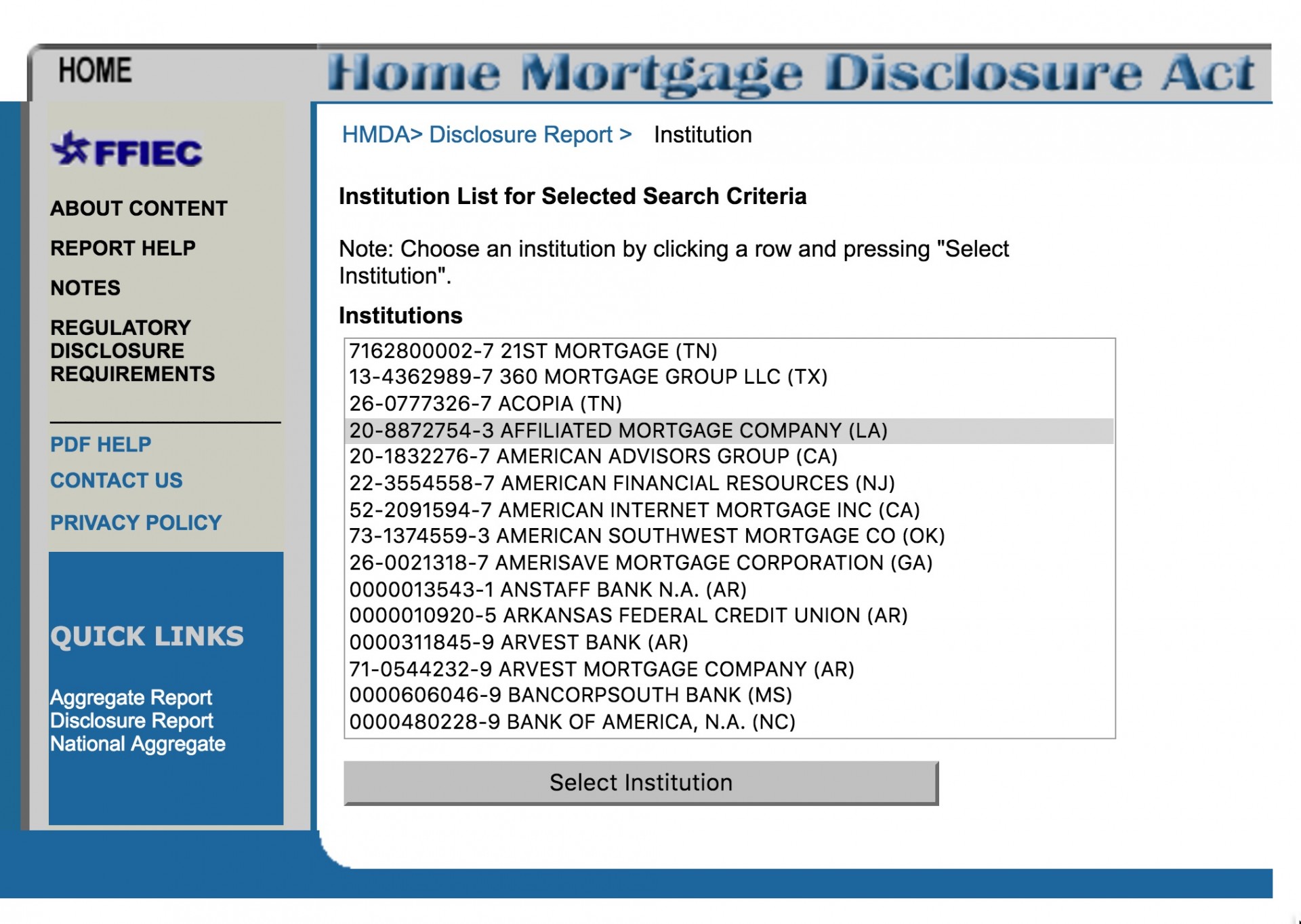
INVESTIGATING THE BANKS
There’s an adventure involving researching
the individual banks and their lending records:
http://www.ffiec.gov/hmda/hmdaproducts.htm
Who are the largest lenders in the region? 2013 Book of Lists, Northwest Arkansas Business Journal
- Cracking PDFs
2. Tabula Demonstration
3. It can get UGLY
Workshop: Revise Graphics
Trupp, Monk and Ward: Produce a single graphic with the bank lending on race
–Work with either Julia or Ginny’s graphic. Use Tableau. Show the lending with and without whites for the banks.
Flores*, Messina, Lyster, Billmyre
–Use Nanci’s graphs. “Normalize” the data to reflect the percentage share of male applications versus female applications.Group the largest reasons together so the bars aren’t as difficult to discern. Cut the “two or more races” and smaller categories.
Dobrin*,Thomas, Taylor Pratt, Ball
-Use Isabel’s chart. Combine conventional and FHA/government.
Put races on the Y axis.
Look for further ways to simplify the chart
Taylor Pray, Eley*, Henry
–Use the bottom line chart. Gather data for 2012 and 2011 and produce a new line chart
–Edit the labels, simplify the race labels and fix percentages
Dobrin, Eley, Flores
–Consult with Wells about this page and how to improve it.
https://wordpressua.uark.edu/datareporting/summary-work-so-far/
Workshop, Part 2
Research Background of Guest Speaker
Prof. Tim Yeager, Walton School

1) Review and Add Questions
2) Research His Background and Academic Work
Work with the Google Doc
First Assignment Due Monday, Oct 10, 5 pm.
So far in class, we have examined the mortgage lending issue from several perspectives so far. In this assignment, you will write a 500 word news analysis article, supply two graphics and underlying data that addresses these questions:
What are some of the primary reasons for mortgage lending disparities in Northwestern Arkansas? For example, examine the income, debt levels described in the Home Mortgage Disclosure Act tables. For context, refer to the U.S. Census Data on median family income for racial groups.
The point of this assignment is to pull together the various strands of our classwork and present it in a coherent news article with some clean graphics.
You will be graded on:
Writing
—Use of Associated Press style, particularly with numbers and data.
—Analysis of the data and trends. Your work will be marked down if you merely describe what you find. I want you to suggest some conclusions or causes from the data. For this assignment, it is ok to use a strong editorial voice and offer your opinions and conclusions from your research.
Graphics:
—Produce graphics that clearly display trends, have correct labeling and attribution of the data. Remember that simplicity is your friend.
Data:
—Produce a spreadsheet with the data clearly labeled and attributed, by year. Your data sources should be explained.
You will upload the a 500 word news article in Microsoft Word, .txt or .rtf format. Papers submitted as PDFs or any other format will not be graded.
Supply two graphics in .jpeg format.
Supply underlying data in an Excel spreadsheet.
All of this is due on Blackboard by 5 pm Monday, Oct. 10.
This is one of your five assignments that count for 50% of your grade.