Categories
- Census
- Class Documents
- Class_Assignments
- Class_SP_2018_Assignments
- Context
- Daily-Class
- Drafts
- Excel
- Fall 2016 Daily-Class
- Fall 2016 Student Work
- Fall 2016 Uncategorized
- Fall 2017
- Fall2018_class
- Graded
- Independent Study
- J2013
- Map
- R Studio
- Schleuss
- Spring_2017
- Spring2019_Class
- SQL
- Student Work-SPRING18
- Student_Work
- Tableau
Archives
- January 2019
- December 2018
- November 2018
- October 2018
- September 2018
- August 2018
- May 2018
- April 2018
- March 2018
- February 2018
- January 2018
- December 2017
- November 2017
- October 2017
- September 2017
- August 2017
- May 2017
- April 2017
- March 2017
- February 2017
- January 2017
- December 2016
- November 2016
- October 2016
- September 2016
- August 2016
Recent Posts
Recent Comments
- rswells on Kris Smith – Student Loan Debt Race/HBCUs
- rswells on Halie Brown – Final, Historically Black College and University Student Loan Debt
- rswells on OVERVIEW – Katie Beth Nichols
- rswells on OVERVIEW for Student Loan Debt Project – Haley Ruiz 11/25
- rswells on Van Dyke FEMALE-line,static,top10,bottom10
Ann
This blog post is missing the questions and comments on the reading. See the homework instructions for this week and please update your post asap.
Comments on graphics
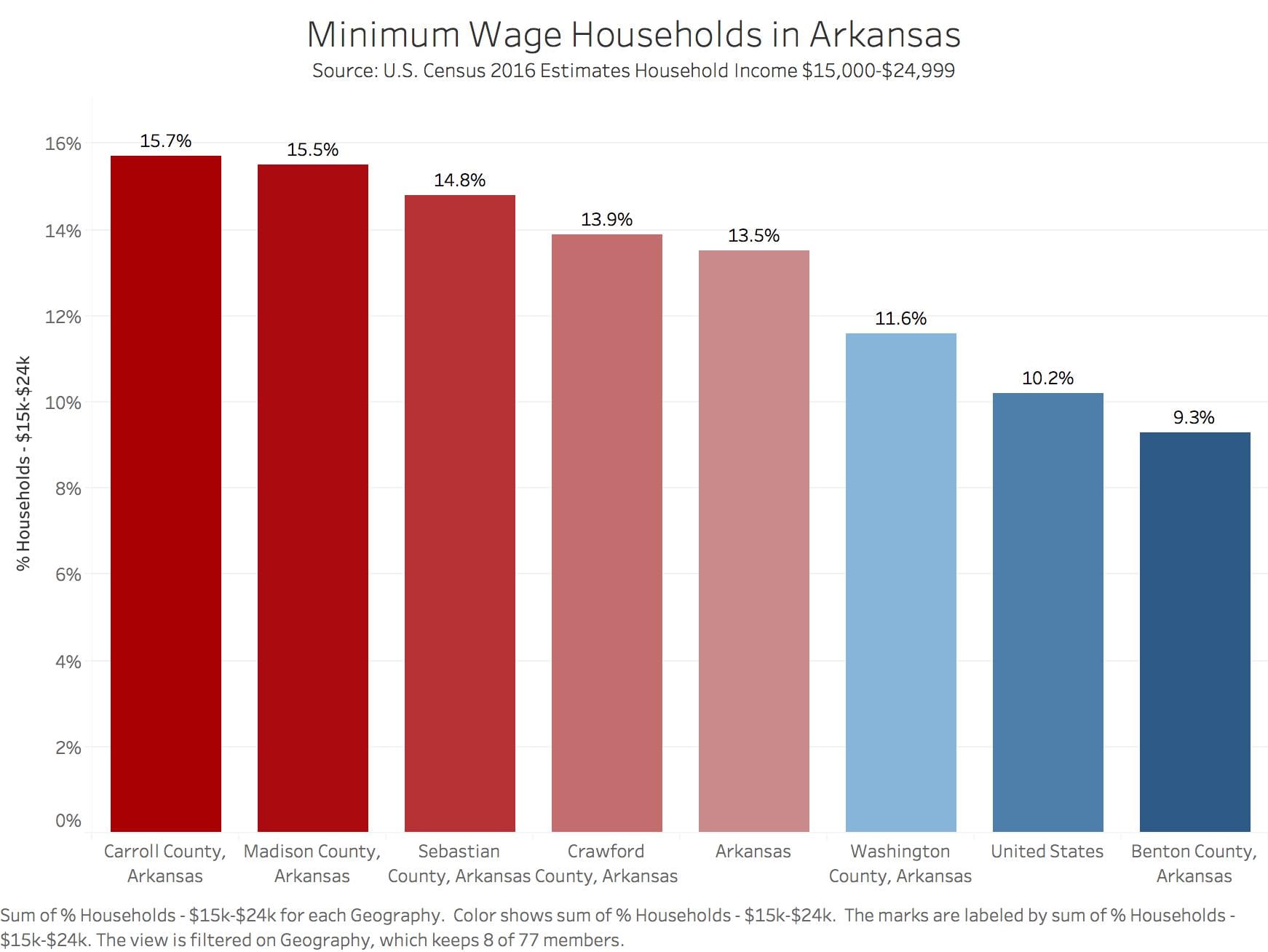
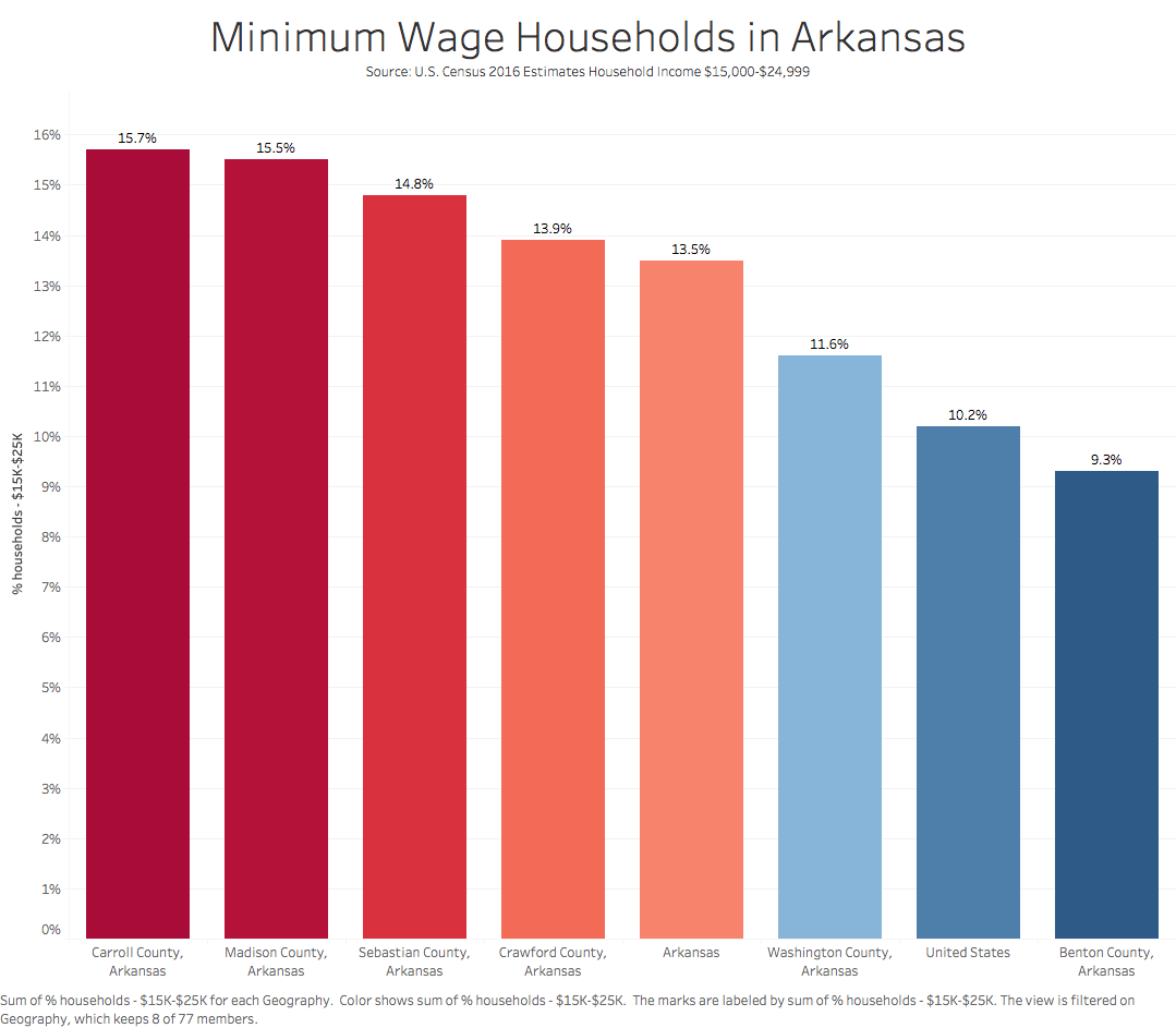
–Minimum Wage Households
That caption should be revised. What does it add to the graphic? I would refine the Y axis label to clean it up — Percent of Households, $15,000-$24,999 income. Clean up the labels to get rid of “county, arkansas.” The rest looks great.
–You submitted two versions of the same graphic. Why?
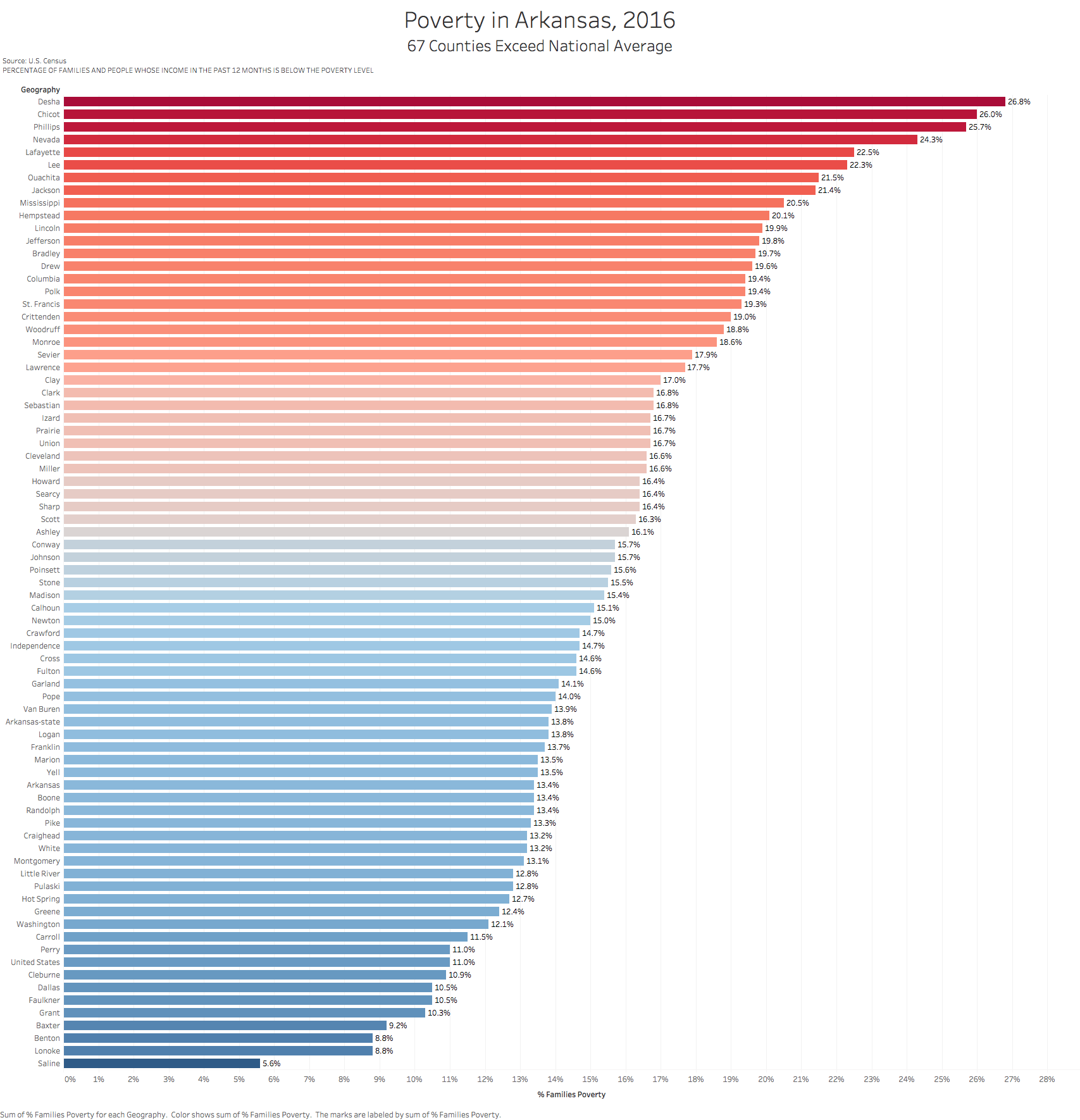
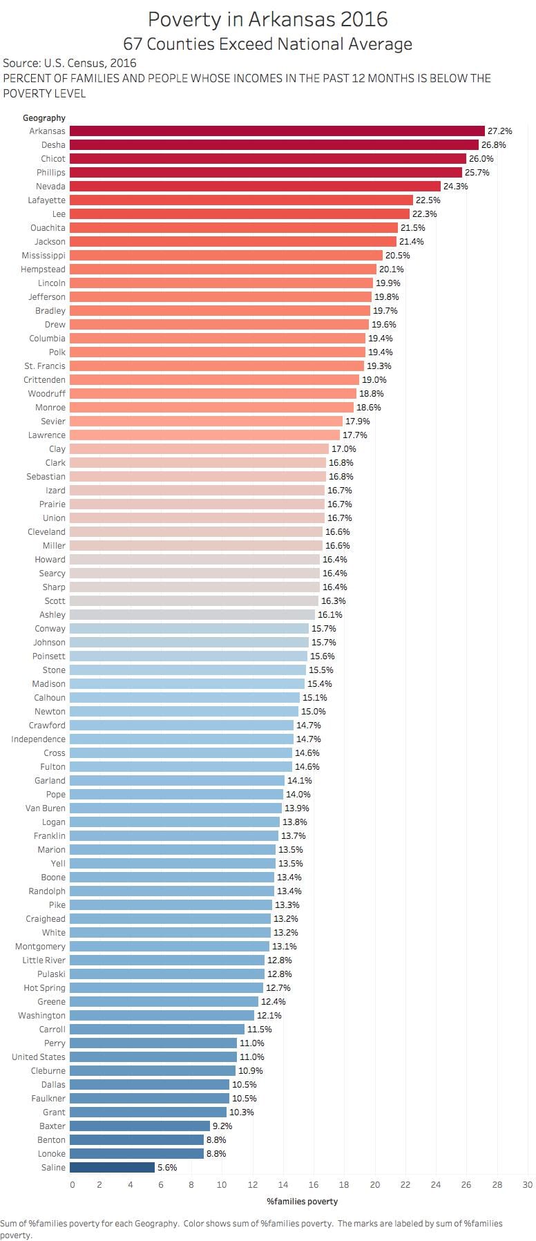
–Poverty in Arkansas, 2016.
This looks terrific. Again, I would revise the caption.
again, why two versions of this graphic?
Missing the single mothers in poverty graphic. Crank that out as soon as you can.