Ann Claire Johnson
Assignment 1- Final
2.22.18
Advanced Reporting and Data Analysis
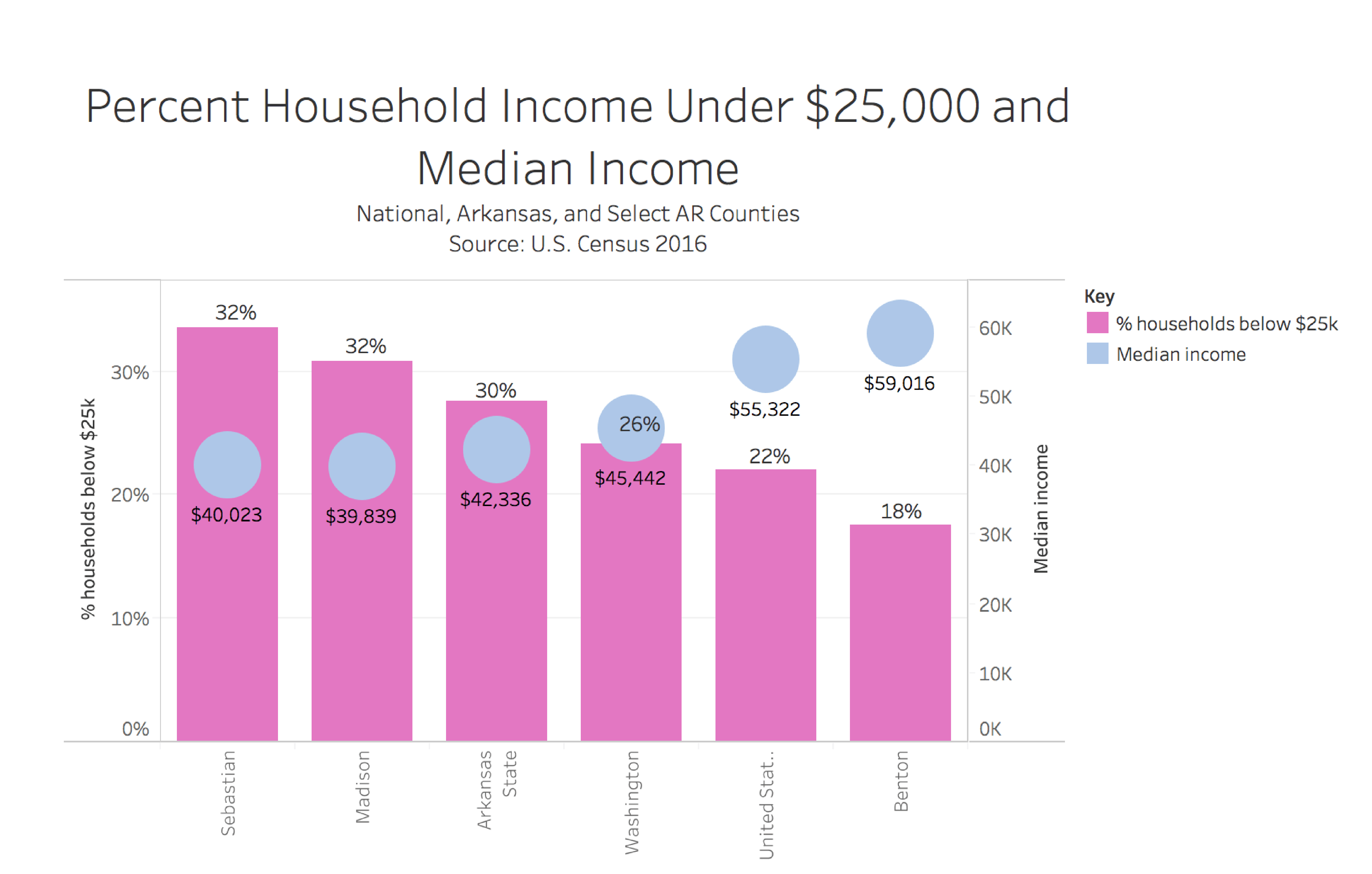
Poverty consumes Arkansas’s population more than what is brought to our attention. After observing most recent economic statistics based on poverty in counties throughout Arkansas, I have discovered that in some Arkansas counties over a quarter of that county’s population has an income of under $25,000. This first graph compares the percentage of households with an income under $25,000 a year to the median household income per county. The counties that have the highest percentage of households whose income is below $25,000 a year also have the lowest median household income. In Sebastian and Madison County, where roughly 32 percent of the households in each county have incomes below $25,000 a year, the median household income is around $40,000 a year. Benton County consistently stands out throughout all of the graphs. Benton County has the lowest percentage of households whose income is below $25,000 a year. Benton County then also has the highest median income at $59,016, which is on average $3,000 more than what the median income for the United States as a whole.
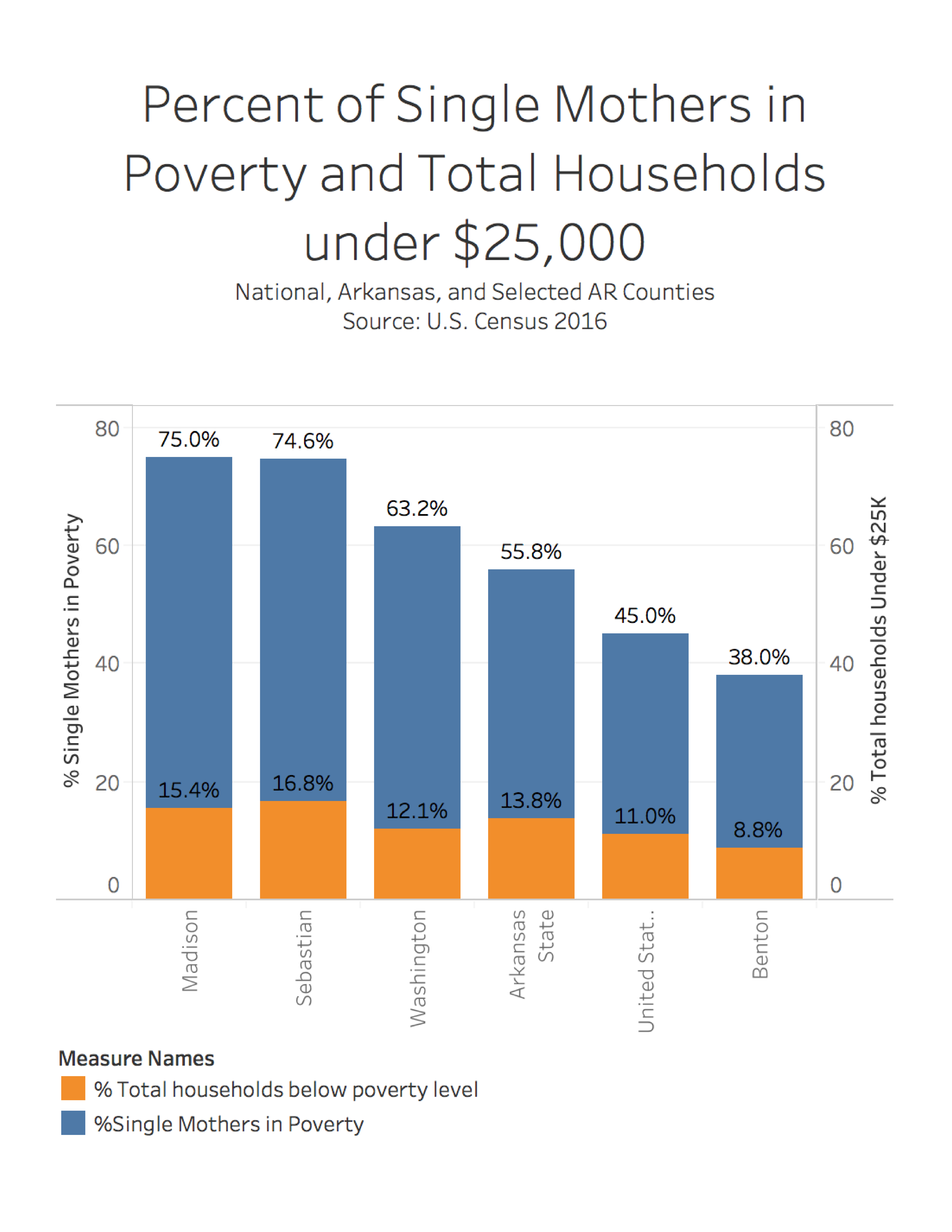
The graph below shows the statistics on the comparison of single-mother households that are in poverty in Arkansas counties versus total households below poverty level. What is so alarming about this graph is that the single mother factor is what makes the difference in poverty in these Arkansas counties. Even in Benton County there is a large jump from 8.8 percent of households below poverty level to 38 percent of single mother households being in poverty.
This graph represents the percentage of people that are employed in poverty. Benton County has the lowest percentage amount of people employed in poverty, 4.9 percent. The highest percentage amount of people employed in poverty are in Washington County, 11.4 percent. The United States had the second to lowest percentage of people that suffer from poverty but are also employed.

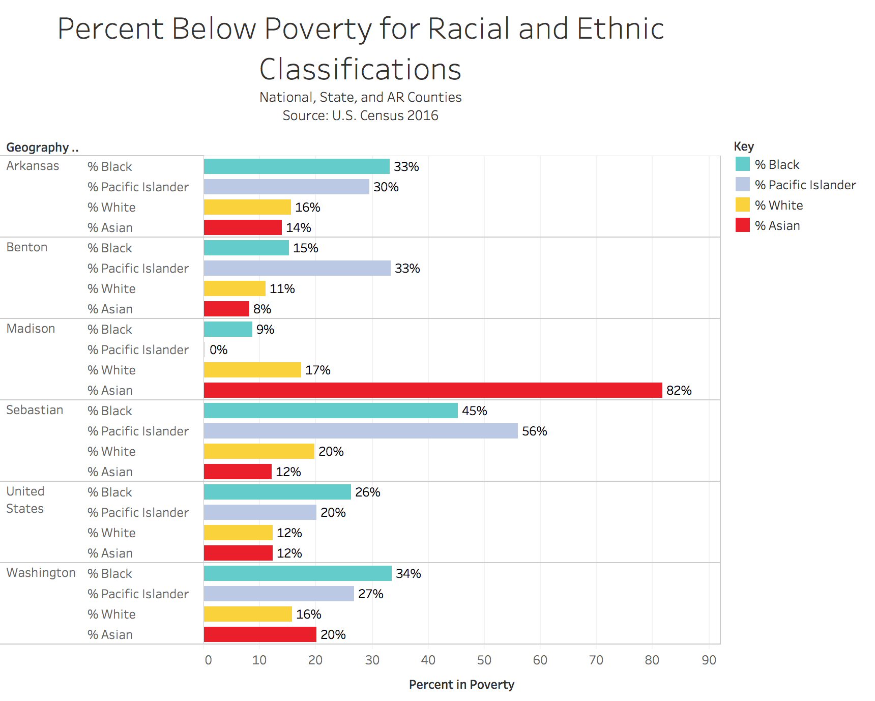
This last graph represents the association of the percentages of people based on their racial and ethic background to where they live. The strangest thing about this graph is that in Madison County, the Asian population has the largest percent below poverty level. This contrasts all of the other Asian percentages in the other counties.
I emailed some comments on revisions. Thanks