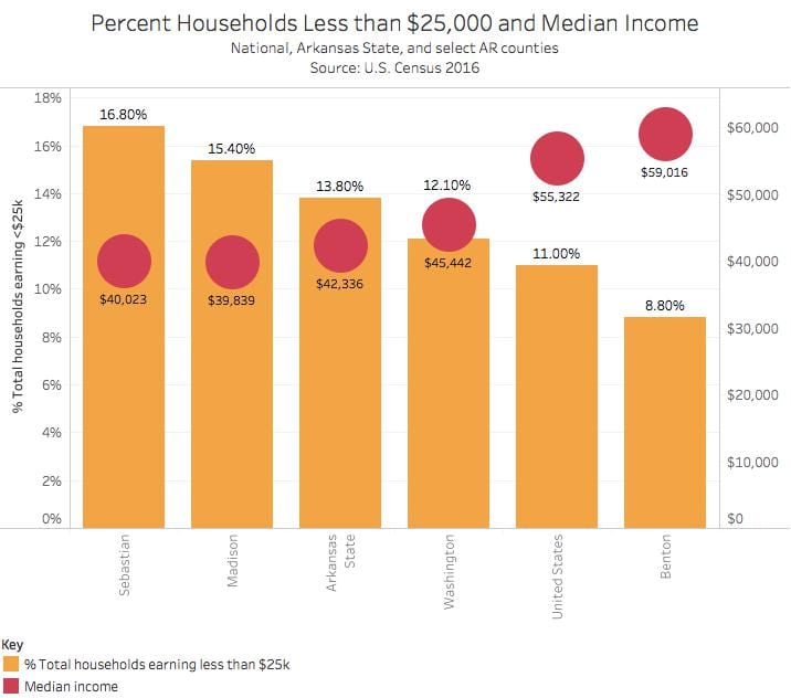
In Arkansas and in the United States there is a relationship between the median income of the area, and the percentage of families living on less than $25,000 a year. Based on data gathered from the U.S. Census you can see the higher the median income the less likely that population will have a household income of less than $25,000.
If you look at the graph below you can easily spot the correlation between the median income and the percentage of that population living off an annual income of less than $25,000. In turn you can assume that higher paid areas have less people in poverty, and therefore less consequences that come tied to poverty.
The percentage of single mothers in poverty is much higher than the percentage of the total population. In some counties in Arkansas three out of four women are raising their children in poverty. The data analyzed in this graph is also single moms with young children. This is another aspect worth considering in the time, money, patience it takes to raise children.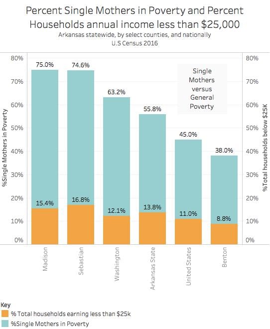
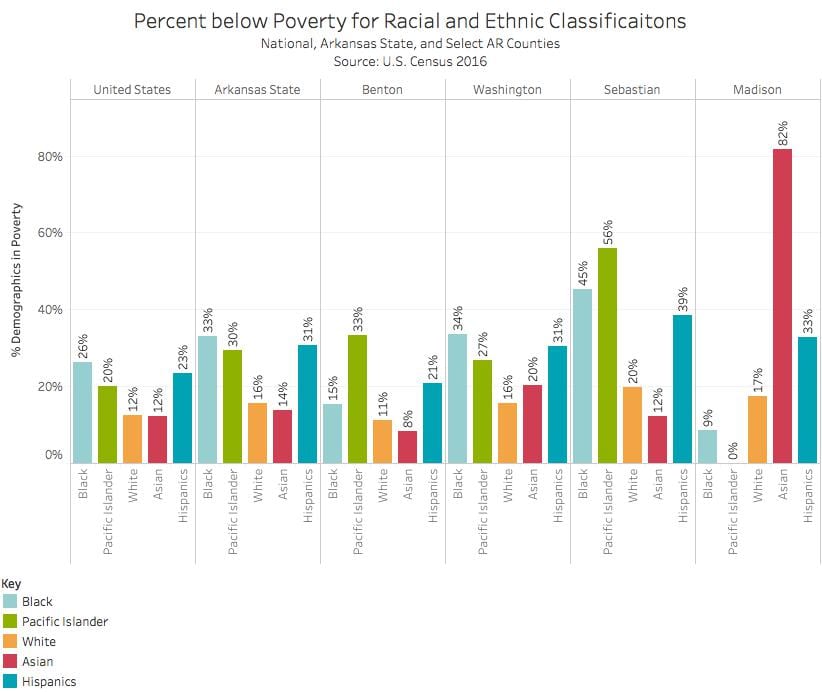
The graph representing the percentages different demographics living in poverty is illustrated in a side by side manner for comparison. Madison county is perhaps the most surprising of the data. It shows that the Asian population is living at a staggering 82% poverty rate. This sounds really extreme especially since it doesn’t match the trends of the other counties, statewide in Arkansas, or even the national average. What needs to be considered here is the size of the Asian community present in Madison County. If it’s small enough then a majority in poverty portrays a high ratio of impoverished asian households
The final graph shows the percent of people living in poverty despite having a job. The highest percentage of impoverished people with jobs is in Washington county. The lowest percentage of lowest impoverished people with jobs is Benton county. Percentages are really easy to overlook, but 11.4 percent means one out of every 10 people are challenged to make a living, feed their family, themselves, not to mention basic care and insurance.

Aubry – You did a very nice job with these revisions. My only comments would be changing capitalization on some of the chart titles and changing the Y axis titles to say Percent instead of %. I plan to share this with the LA Times data guru and with Arkansas Public Media. Best, Dr. Wells