Categories
- Census
- Class Documents
- Class_Assignments
- Class_SP_2018_Assignments
- Context
- Daily-Class
- Drafts
- Excel
- Fall 2016 Daily-Class
- Fall 2016 Student Work
- Fall 2016 Uncategorized
- Fall 2017
- Fall2018_class
- Graded
- Independent Study
- J2013
- Map
- R Studio
- Schleuss
- Spring_2017
- Spring2019_Class
- SQL
- Student Work-SPRING18
- Student_Work
- Tableau
Archives
- January 2019
- December 2018
- November 2018
- October 2018
- September 2018
- August 2018
- May 2018
- April 2018
- March 2018
- February 2018
- January 2018
- December 2017
- November 2017
- October 2017
- September 2017
- August 2017
- May 2017
- April 2017
- March 2017
- February 2017
- January 2017
- December 2016
- November 2016
- October 2016
- September 2016
- August 2016
Recent Posts
Recent Comments
- rswells on Kris Smith – Student Loan Debt Race/HBCUs
- rswells on Halie Brown – Final, Historically Black College and University Student Loan Debt
- rswells on OVERVIEW – Katie Beth Nichols
- rswells on OVERVIEW for Student Loan Debt Project – Haley Ruiz 11/25
- rswells on Van Dyke FEMALE-line,static,top10,bottom10

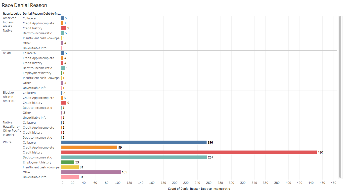
A lot of charts here! Some comments:
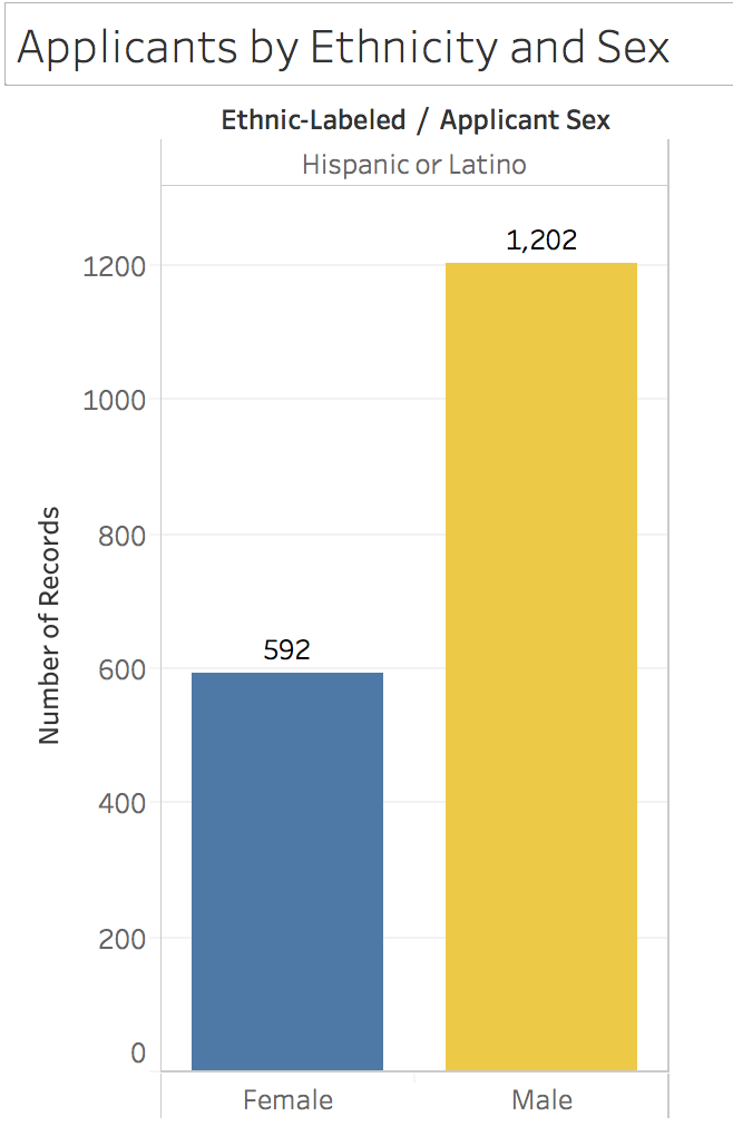
Chart #1 – Clean and simple. Good deal
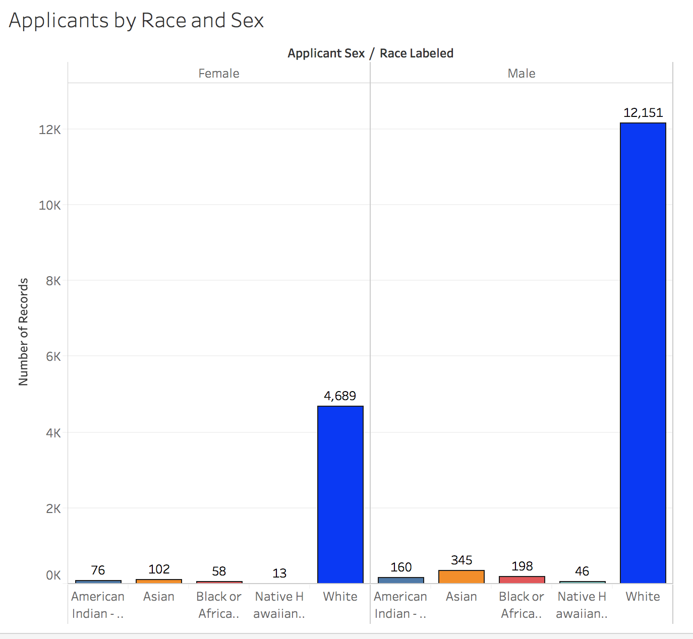
Chart #2 – Would be good to group the male-female by race
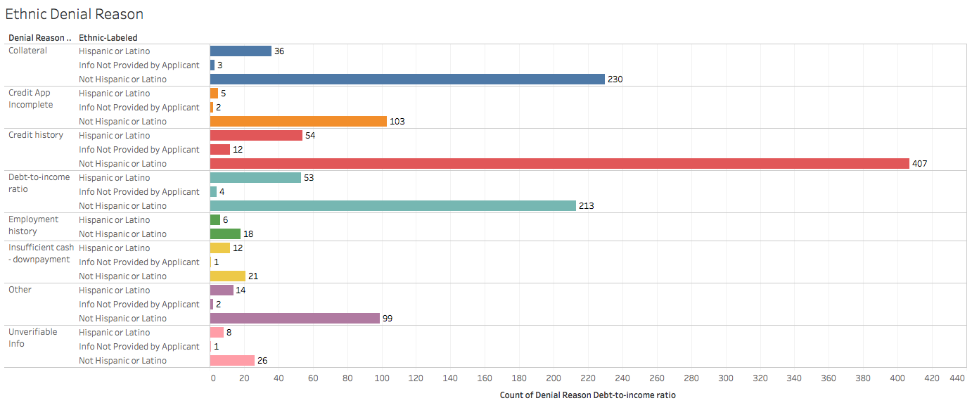
Chart #3 – I would cut out the info not provided by applicant in the Hispanic denial chart. Fix the X axis label to show just “Count of Denial Reasons”
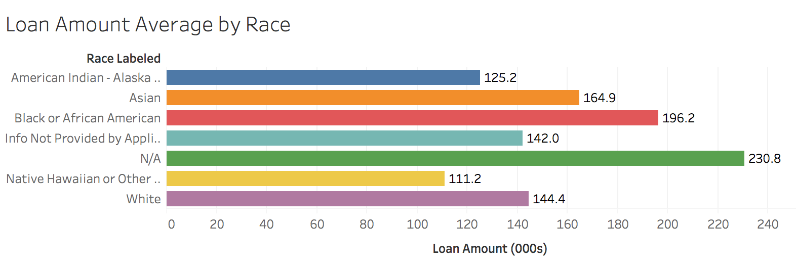
Chart #5 – Loan Amount average by race – Let’s fix this and get dollar signs on the labels. I want to double check your spreadsheet calculations on this too.
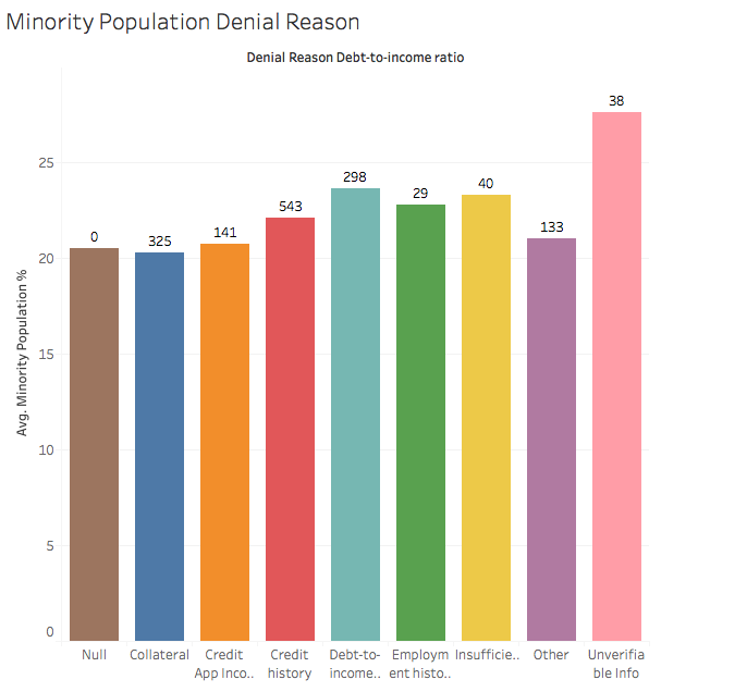
Chart #6 – Rejection reason by minority population. Let’s sort it – highest to smallest, L—>R. Get rid of the null category.
Very nice work here.